Quantcast
Channel: photoshop – Treehouse Blog
Viewing all 20 articles
Browse latest View live

Responsive Web Design in the Browser Part 1: Kill Photoshop

$
0
0

If you’re like me then you’ve had a love/hate relationship with Photoshop for almost a decade. The software is bloated, it crashes right at the moment you forgot to hit save, and it produces a design that is nothing more than a useless and non-functioning image to send to clients.

Despite loathing the software that is the staple of our industry, we can’t live without it. High fidelity mockups have spoken in a way that we just can’t beat with any other applications… until now. Let’s explore the next stage in the evolution of the web and one where Photoshop is a waste of our valuable time. Here’s how to kill Photoshop and do responsive web design in real-time with the only app we need: the browser.

Why Kill Photoshop?

1. It’s Double the Work.

The main reason to kill Photoshop is because it doubles or even triples your current workload. You can spend hours of your precious time inside of Photoshop and what do you get? A picture.

2. Clients Can’t Use It.

This brings me to my second point. Photoshop produces a mockup that clients simply can’t use. To quote Steve Jobs, “Design is how it works”, and if your clients can’t use what you’ve built then you’re missing a huge piece of the puzzle. Once your clients get to use your design and they find that it doesn’t work for them, if you’ve used Photoshop you’re back to square one.

3. You Can’t Make Changes Live.

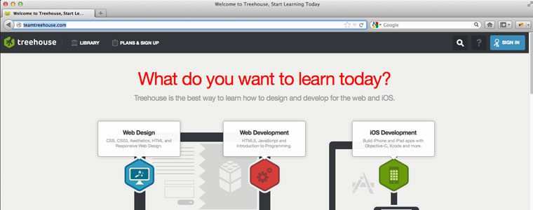
If you’re designing in the browser you can make changes to your design in real-time. Let’s say you have a client drop in the office and they want to change the color of the main headline (or gasp, the size of the logo), but they’re not quite sure what color they want it to be. You launch your browser with a single tool (more on this later) and iterate as many colors quickly to find the perfect shade of light-ish, aqua-ish, color of my second wife’s Mercedes, blue. (you know exactly what I mean)

redheadline Responsive Web Design in the Browser Part 1: Kill Photoshop

Client wants a red headline? Who needs Photoshop when you can make changes live in Firebug?

4. CSS is Ready.

For years there were certain things that we needed Photoshop for that CSS just couldn’t do. These included things like buttons, shadows, borders, etc. Now that CSS is all grown up, we can do many of the stylistic elements that we crave in CSS, and Photoshop is needed less and less with every new release.

5. Photoshop is Expensive.

Part of the beauty of the web is that it’s income-agnostic. Anyone can get into web design with a basic PC (gross) or an older model of Mac (yum, that’s better). The problem for years has been that you needed a machine that could handle the load it required for the latest version of Photoshop that you had to mortgage your home to get in the first place. You can keep from having to sell your little sister to buy Photoshop now that you can design straight in the browser.

6. Photoshop is Static.

Now that we’ve established that Responsive Web Design is the future of the web, why spend time designing a website in Photoshop that isn’t fluid? If you feel the urge to design each breakpoint (where the Responsive Design breaks) in Photoshop, then return to my first point and change “Double the Work” to “Six Times the Work”.

psd workspace Responsive Web Design in the Browser Part 1: Kill Photoshop

Working inside of Photoshop only gives you an image that clients can’t use.

7. Photoshop Has No Prototype Value.

Sure you can prototype the look of a website inside of Photoshop, but you can’t iterate on the fly. The new evolution of the web places an enormous value in the ability to let a design evolve with use. Designing in the browser also affords you the luxury of creating multiple style sheets for your markup to drastically change the look and feel of your site with just a few changes in the style sheet link. From there, you can again fine tune your design live to really hone in on what the client wants.

8. You Start with Content, Not Style.

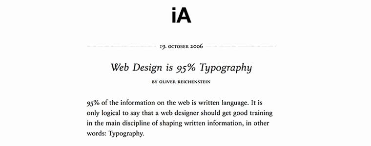
A good web designer understands the holy grail of designing for the web: great markup. Content out or the content first approach to design isn’t just a fad, it’s gospel. In his famous article, The Web is 95% Typography, Oliver Reichenstein of Information Architects, argues:

“95% of the information on the web is written language. It is only logical to say that a web designer should get good training in the main discipline of shaping written information, in other words: Typography.”

informationarchitects Responsive Web Design in the Browser Part 1: Kill Photoshop

Oliver Reichenstein argues that the web is 95% Typography.

It’s important to note that “shaping written information” refers to style, but my point here is that if the content that you use is 95% of your design, then the majority of your time in Photoshop is wasted on 5% of a great design. In that light, you’re also spending that time in the wrong order. Designing your content first and coding semantic, standards-based markup is the foundation of a great design and not something you approach as an after thought of Photoshop. Having this markup first allows you to iterate your styles quickly without having to reinvent the wheel every time you make a change.

Conclusion

The next era in designing for the web is a more advanced, mature and intelligent one. It’s about streamlining, semantics, great markup, responsive or fluid design, great typography, web fonts, content first, rapid prototyping and advanced javascript. My argument is that html, CSS and the browser tools we need have all advanced us past the point of needing Photoshop. If you want to be a great designer moving forward, I would start thinking about “Killing Photoshop”.

…and here’s a bonus reason to kill Photoshop: no more spinning beach balls! In part 2, we’ll take a look at the tools you’ll need to start your new strategy for responsive web design in the browser.

The post Responsive Web Design in the Browser Part 1: Kill Photoshop appeared first on Treehouse Blog.


Responsive Web Design in the Browser Part 2: The Tools

$
0
0

Now that we’ve killed Photoshop, we need to get into the nitty gritty of how to still make a living without our favorite, yet most frustrating app. After all, talking about what’s broken without offering a solution doesn’t do anyone any good.

In this second installment of Responsive Web Design in the Browser, I want to talk about what I use everyday to try and escape the gnarly grasp of the Photoshop beast. It’s not a perfect system yet, but it’s getting better everyday. I hope this gives you a starting point and a few resources to develop your own process for designing in a post-Photoshop world.

Important note: You may be a designer that designs only in Photoshop and you’ll argue that this article suggests that all designers should code. Honestly, that’s exactly what I’m proposing. We’re talking about web design and to me it makes more sense to use the web to design than using an image editor.

Here’s my process for designing without Photoshop:

1. Choose Your Text Editor.

The text editor is by far the most important tool for the web designer. It’s the lifeline app that we absolutely can’t live without, not Photoshop. Although everyone with a computer has access to a free text editor, there are three main editors that seem to currently be the most popular.

Sublime Text

sublimetext Responsive Web Design in the Browser Part 2: The Tools

Sublime Text 2 is the most widely used among our Treehouse team.

If you’ve watched any of the most recent Treehouse Tutorials, you’ll notice that the designers (and developers for that matter) on the teaching team have all been using Sublime Text 2. It’s a clean text editor with much of the functionality you need, while getting rid of the stuff you don’t.

Coda 2

coda2 Responsive Web Design in the Browser Part 2: The Tools

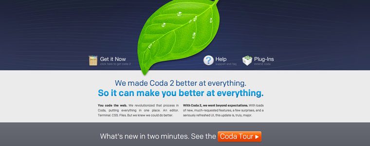
Coda 2 from Panic is a great editor for designers and works great with Transmit for ftp.

Coda 2 is the latest installment from Panic. It has many extra great features and works nicely with a built-in ftp functionality that lets you quickly upload your files to your server. It’s important to note as well that many designers prefer Coda because the interface has a much more “designed” feel to it.

Textmate

textmate Responsive Web Design in the Browser Part 2: The Tools

Text Mate has been a go to editor for designers and developers alike.

Textmate has been the stripped-down text editor that many people have loved for years. It’s simple, yet gives you the color differences and collapsing that you don’t get with the free editors.

2. Create Your Markup in HTML.

A great design should start with the content. Although getting content from a client is harder than getting them to approve a Photoshop mockup, designing from the “content out” gives you the basis you need to decide the approach you want to take. How can you design the best solution when you’re not sure of what needs to be said? Our jobs as designers are to be great communicators and establishing what the client wants to say is a great place to start.

Once you’ve got your content, mark it up in html using the best practices of creating great, semantic markup. Make sure your markup is completely accessible to those that have disabilities as well as making it ready for readers like Instapaper or Readability.

3. Create Your CSS Reset and Stylesheets.

Now that you have the html structure of your website, decide on the best CSS reset so that you eliminate all of the built-in styling from the individual browsers to give yourself full control of your styles.

Once I’ve decided on a reset, I usually create multiple stylesheets in my text editor, with media queries at popular breakpoints, and save them. I create multiple stylesheets like most people create multiple mockups in Photoshop. All of have to do to show a client a different look is change “style1.css” to “style2.css” in the link in the head tag of my html document. Once they’ve decided on which look they like, we can work together in the browser to make the final tweaks. For now, we’re just setting it up so we have this ability once the design is complete.

imagemagicequation Responsive Web Design in the Browser Part 2: The Tools

The Magic Equation for Responsive Images will be set by your baseline CSS reset.

Once I’ve got my stylesheets created, I usually hop on over to Colour Lovers or Kuler to find a color palette I like based on the colors from the client’s logo or branding guidelines. Then I place the color values in the comments atop the CSS file so I have them for reference throughout my design process.

4. Upload and Hookup Your Javascript and jQuery.

The next step in our setup is to define the different types of Javascript files we want to use for our project and make sure that they’re loaded and the scripts are placed in our code to “hook them up”. Here are a few of the Javascript files I’ve used on multiple projects:

FitVids.js

fitvids Responsive Web Design in the Browser Part 2: The Tools

FitVids, from the lads at Paravel, Inc, is the best plugin I’ve found for creating responsive videos.

If you’re going to be using video in your design, FitVids.js from Paravel is a must have. You’ve likely encountered this plugin on just about every responsive site you’ve visited lately. I don’t know what I would have done without it.

FitText.js

fittext Responsive Web Design in the Browser Part 2: The Tools

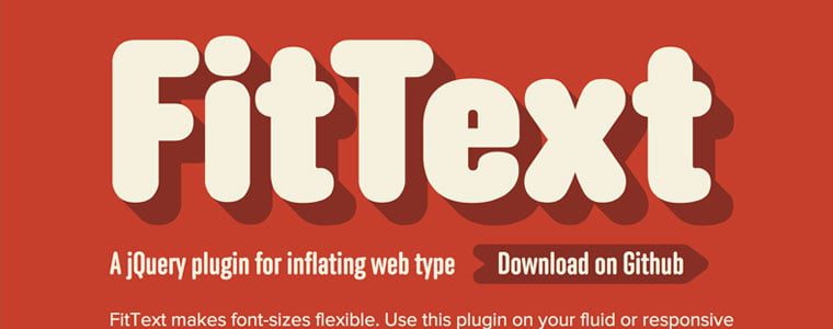
FitText.js, also from Paravel Inc, makes sure that your headlines always look good.

FitText.js is another Javascript plugin from Paravel that allows you to create fluid headlines that fill the container that you’ve given them. It leads to a better design and one that doesn’t look broken at certain break points.

Respond.js

What would web design be without having to look out for other browsers? Even more than Photoshop, this is probably the biggest frustration in the world of web design. Luckily, there are genius people out there that create great Javascript like Respond.js to take care of the browser support for us.

5. Open Your Browser of Choice.

In order to design using the browser, we’re going to have to pick one, naturally. The big three are Safari, Chrome and Firefox. Designers typically choose one based on their own preferences or biases, but all three are great and have their own developer tools.

Firebug

firebug Responsive Web Design in the Browser Part 2: The Tools

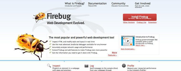
Firebug is a developer tool you can use with Firefox to tweak your CSS live in the browser.

One of the great things about designing with Firefox is the Firebug developer tool. I’ve used this one for a long time and have had a great time using it to design in the browser.

6. Know The Magic Equation.

themagicequation Responsive Web Design in the Browser Part 2: The Tools

The Magic Equation for turning pixels into percentages in responsive web design.

The most important key in Responsive Web Design is knowing the magic equation. This isn’t necessarily a post on how to do Responsive Design so I won’t go into great detail here, but knowing how to convert pixels to ems and percentages is absolutely vital.

7. Build Your Fluid Grid.

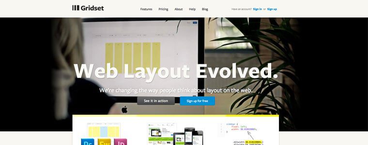
Gridset

gridset Responsive Web Design in the Browser Part 2: The Tools

Gridset is a web app developed by the team at Boulton Design to help you create the perfect grid.

Gridset, the great new tool from Mark Boulton and the awesome crew at Boulton Design, will allow you to build the perfect responsive grid for you new project. I’ve used it a lot lately and recommend it to anyone looking to experiment with different grids. It also allows you to save grids from other projects for future use.

Frameworks

If starting your grid foundation from scratch isn’t for you, then Bootstrap, Foundation, and Skeleton are a just a few of the Responsive CSS frameworks that are available to you. They come complete with grid structure, content layout, and built-in CSS for buttons, etc. Frameworks enable you to get off the ground and running even faster, and they have a structure that has been proven over and over again to be reliable and flexible.

8. Set Your Fonts, Type and Layout.

Now that you’ve got your basic grid laid out, it’s time to consider how you will structure and style your text. Knowing what your reader’s needs are, and then designing the proper content structure for them, will lead to the best product possible.

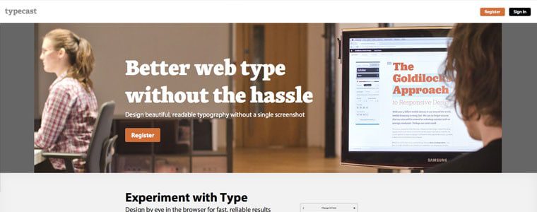
Typecast

typecast Responsive Web Design in the Browser Part 2: The Tools

Typecast allows you to try different fonts, font sizes, line heights and layouts in real-time.

I’ve had the great pleasure of using a new web-based tool for designing content-first layouts called Typecast. Rarely have I ever had so much fun using an app to set type and content style.

Using the fonts from the great web font services like Typekit, Fonts.com, Font Deck, and Google, you can use Typecast to see how your fonts will look in real-time and right there in the browser. It’s amazing and you’ve got to check it out. It’s currently in beta, but after they personally took me through the app, I see it as being a huge game-changer.

9. Test, Test, Test.

Since Responsive Web Design has gained so much traction, that means that people everywhere are creating great Javascript to aid in its growth. A few websites you can use to test your designs in the browser are Responsinator, Responsive.is, and Responsive Design Testing, just to name a few.

10. Edit Your Images.

Here is one of the biggest challenges facing a world without Photoshop. We still have to take care of crafting and preparing our images. Luckily, we have new alternatives such as Acorn that are less expensive and a lot less bloated. Also, if you’re on a tight budget, you can just Google free online image editors and pick the one you like the most.

Conclusion

I know that this topic is a sensitive one. For years designers have used Photoshop to push our craft forward. I’m not so naive to think that Photoshop will disappear overnight, but I wanted to show you, our great reader, that the future of Web Design is upon us.

Two great strategies, Designing in the Browser and Responsive Web Design are both here to change our industry and change the way we work. I hope this article opened your eyes to some new possibilities and some new tools. Go forth and create, but do it in the browser!

Test out these strategies and tools, decide what works for you, and write me to tell me about it. I can’t wait to hear how it goes…

The post Responsive Web Design in the Browser Part 2: The Tools appeared first on Treehouse Blog.

Quick Tip: Using Brushes & Patterns in Photoshop

$
0
0

In this Treehouse Quick Tip, Allison Grayce teaches us how to load and use brushes and patterns in Adobe Photoshop. Allison is a web design teacher at Treehouse. From brand strategy and user interface design to creative writing and front-end development, she has a passion and appreciation for complete brand experiences. Allison holds her BFA in Web Design & Interactive Media. Twitter: @allisongrayce.

If you enjoyed this video, be sure to check out Treehouse, the best way to learn about web design, web development, business, and mobile apps.

Other topics on Treehouse include topics like …

Video Transcription

Hi, I’m Allison Grayce. In this Treehouse quick tip, we are going to learn
how to load and use brushes and patterns in Adobe Photoshop.

I am looking to use some brushes in my design using texture and grunge.
There tons of brushes and patterns on the Internet that you can find, but
I’m going to find my favorite brushed by Liam McKay, function subtle grunge
brushes. I am going to go ahead and download them form Designmoo, which I
will link to in the description box.

Go ahead and extract the zip folder, and inside should be an ABR file. Copy
that file, go ahead and navigate to applications, Adobe Photoshop CS6, in
my situation. Click on presets, brushes, and go ahead and go ahead and
paste the ABR file into this directory. The brushes already in here are
Adobe’s default brushes.

So you can go ahead and close the finder here and minimize your browser and
head back on over to Photoshop. Select the brush tool from your toolbar by
pressing B on your keyboard, or just clicking on it in your toolbar.
Navigate to your options bar and click the drop down arrow. Go ahead and
click the gear button here, or in your case, depending on which version of
Photoshop you’re using, this might be an arrow and click replace brushes.

We’re going navigate to the directory, where we paste our ABR file and we
are looking for function subtle grunge. Go ahead and click open, your new
brushes will now appear in the scrolling area in the drop down menu of the
options bar. Go ahead and select one of the brushes. I am going to add a
mask to the shape that I want to apply the texture to. To preview the
brush, press the caps lock button on your keyboard.

So I am going to head on over to the layers panel and add a mask that I
want to add texture to. In this case I am going to add texture to the grey
circle. So go ahead and press the add layer mask button right here and
making sure you have black as your foreground color, go ahead and click on
the canvas to apply the texture. You can just click around to add more
texture, press control Z to undo the texture. It’s really just a matter of
experimentation.

I think that looks pretty good. Now I want to add texture to the
background. I want this texture to be a repeating pattern. My favorite
tile wall patterns are from Tileables, and I am going to navigate to their
website and download a repeating paper background. You can either download
the entire pack here, or you can just click on one, open image in the new
tab. I am going to copy this image, bring it back into Photoshop, create a
new document and paste the image.

Now that I have the tileable image, it’s time to define it as a pattern.
You do so by going to the menu bar at the top and pressing edit, define
pattern, and feel free to name this pattern as you wish. I am going to make
this document a little bit larger. You can delete the solid color
background, create a new layer, making sure that layer is underneath the
circle.

Go ahead and choose the paint bucket tool from your toolbar and navigate on
up to the options bar. Click the drop-down menu next to the thumbnail here,
and you will see your new pattern. Go ahead and select that and you can
click on the canvas and we are done.

By using brushes and patterns we’ve pushed this design to the next level.
Now that you know how to load and use brushed and patterns in Photoshop,
the endless looks you can achieve with these tools are only limited to your
imagination. Using these tools will create a tactile and artistic feel,
setting your design apart from the rest.

[Recording: If you would like to see more advanced videos and listen to
more videos like this one, go to teamtreehouse.com and start learning for
free.

The post Quick Tip: Using Brushes & Patterns in Photoshop appeared first on Treehouse Blog.

What to Do When You Can’t Design in the Browser

$
0
0

How it used to work

In the past, once we were given website content by the client or project manager, we’d move forward with a digital wireframe or sketches. We may have even made those wireframes interactive using great resources out there like MockingBird or InvisionApp. Later we’d design every last detail in Photoshop down to the kerning on type, and border-radius’ on buttons. Usually after a series of revisions, the approved design would be sliced up, coded and tweaked it until it looked just like the comp. And finally, when it looked exactly the same in every browser, we’d launch it.

The problem with this process

Unfortunately as web designers & developers (but fortunately as consumers), we don’t just have a couple types of mobile devices and a handful of screen resolutions anymore. Mobile websites aren’t seen as a secondary or additional website to the desktop version. They are now seen as one. We live in a world with tons of different devices and resolutions, and new ones coming out everyday. We should be happy with this forward movement in technology… right?

Well… it’s kind of thrown a wrench in our process. Showing the client a high fidelity 980px wide comp isn’t the best deliverable anymore. Right off the bat it this sets false expectations. But is designing a tablet and mobile equivalent of the same site really an option? No. That would take forever. So how can we evolve our process moving forward to accommodate for the responsive web?

“Design in the browser!”– Awesome people in our industry

Many leaders in the industry have advocated designing in the browser. And I get it. It makes total sense. The father of Responsive Web Design himself, Ethan Marcotte, refers to static comps during the responsive design process as a “catalog of assumptions”. Meagan Fisher wrote a great article back in 2009 and quoted her then boss, Dan Cederholm – “a website’s design should begin where it’s going to live: in the browser.” And our very own Josh Long recently wrote a really convincing article about why we should kill Photoshop.

Why I can’t do it

I’ve found it really difficult to adapt this way of design. Maybe it’s because I’ve always considered myself to be a designer first, and a developer second.

When I’m in Photoshop, it’s a blank canvas where me and my right brain are free to explore all sorts of creative UI solutions without the distraction or limitations of code. Do whatever I want and figure out how to make it work later on. Diving right into code for me personally, has a couple of negative consequences – the design ends up being sterile, too simple, and nothing exceptionally innovative. It’s also way too much commitment. Early on in my design process I like to rapidly prototype, move things around and try different things. I keep building and moving things around until I like it and want to commit to making it a reality in code.

Okay so maybe I’m a little obsessive compulsive. I don’t like the idea of letting go – but that’s what we need to do. I see Responsive Web Design as the final push to let go of some of this control we as designers have tried to hold onto, in an era where it’s just no longer possible.

Moving Forward

So for those of us on the same page, how do we move forward? How to we evolve our process for responsive web design? While it’s still something I’m trying to nail down myself, I thought I’d share with you the direction I plan on heading.

Sketch

This is a step for me that will never go away. But it can evolve. Instead of using my beloved UI stencils browser sketch pad, it’s time to invest in a few of AppSketchbook’s responsive design sketchbook. For days when I’m feeling less fancy, I’ll simply draw out a few breakpoints in my Whitelines sketchbook. Thinking about how breakpoints will affect your layout early on in the design process will make things easier for you later on.

Wireframe

Once I’ve nailed down my layout, I’ll take it a step further and wireframe the actual content around a grid at various breakpoints in either Illustrator or Photoshop. Here, I can begin playing around with fonts, button styles, and begin developing the UI – making sure to avoid too much detail to save time.

Screen Shot 2012 09 27 at 1.38.45 PM What to Do When You Can’t Design in the Browser

Smells Like Bakin’ Wireframe

Leaving detail out also allows the client to focus on the content itself, instead of the decoration around it.

UI Style

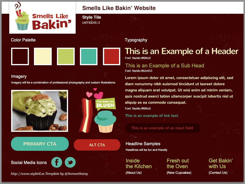
This is where the big change takes place. Instead of moving forward with the wireframe and designing a full-fledged mockup which is too precise, or gathering inspiration for a traditional moodboard which is too vague, I’ll use something like Samantha Toy’s “Style Tiles” to create a visual design for the brand.

Screen Shot 2012 09 27 at 2.23.48 PM What to Do When You Can’t Design in the Browser

Smells Like Bakin’ Styles

It’s much easier to create a series of these “UI moodboards” than go through several revisions of detailed mockups.

Code

Now that we have a layout nailed down, a clear direction for the user interface, and an idea of how our website will break down, we can confidently move forward with the code.

Conclusion

With this new process, we’ve solved most of our issues here with designing in the browser. I feel like it’s a happy middle ground to saving time and energy that Photoshop has cost us in the past, without sacrificing the creative aspect of designing a website. It will still be a big change, but a bit less drastic than completely killing off Photoshop and diving right into code.

It all comes down to what works best for you and your company. There’s no right or wrong process, it’s just about finding one that’s most efficient for you.

The post What to Do When You Can’t Design in the Browser appeared first on Treehouse Blog.

Quick Tip: How to Achieve Pixel Perfection in Photoshop

$
0
0

In this Treehouse Quick Tip, we’re going to learn how to deal with unwanted anti-aliasing in Photoshop and achieve pixel perfection when working with vector shapes. This method is referred to as pixel-hinting.

Using Adope Illustrator and Photoshop, you can apply pixel hinting to your vector shapes to get exactly the design you are looking for.

Video Transcription

Allison: Hi, I’m Allison Grace. In this Treehouse Quick Tip were going
learn how to deal with unwanted anti-aliasing in Photoshop
and achieve pixel perfection when working with vector
shapes. This method is referred to as pixel hinting. In
this quick tip I’ll be using Adobe Illustrator CS6 and
Adobe Photoshop CS6.

Now I’ve gone ahead and created a simple logo in
illustrator and I want to bring that logo to use in a
design I’m working on in Photoshop. So, Control+A to select
all, then Control+C to copy and let’s navigate on over to
Photoshop. So, let’s go ahead and Control+V to paste the
logo.

Photoshop gives us a dialog box that asks how we want to
paste in our vector shape. Since we want to be able to edit
the paths, we’ll paste it in as a shape layer. So, I’m
going to go ahead and scale the logo to my desired size,
because if I resize the shape after pixel hinting I’d need
to do it all over again. We’re going make this logo white,
perfect.

So, let’s go ahead and zoom in a little bit closer here. If
you notice, there is some unwanted anti-aliasing happening,
especially around these horizontal lines here. What that
does, if we zoom back out is it actually makes the logo
look a little bit blurry. This happens to a lot of vector
shapes because the paths are not completely taking up one
whole pixel. They’re taking up a little more or a little
less. Sometimes for it to appear perfect we’ll need to
adjust the shapes.

Now, in CS6 we’ll need to head to Photoshop, Preferences,
and General, and head on over to the very to the very last
check box here and uncheck Snap Vector Tools and Transform
to Pixel Grid. Press Okay. Turning this option off will
let us manually adjust where the paths fit into Photoshop’s
pixel grid. You’ll want to turn it back on if your drawing
shapes in Photoshop later.

So let’s go ahead and right click and select the shape. We
can see the paths that make up the vector shape now.
First, let’s go ahead and zoom in on the icon here. As you
can see this part of the paper airplane is not a perfectly
straight line and because of this, it’s causing some
fuzziness in the logo.

So, if we navigate over to the toolbar and select our
direct selection tool, we can grab the anchors on our path.
Then we can use our right arrow to nudge it to the right.
We can see now that the line is beginning to appear
sharper. We’ll do the same thing with this anchor.

Now, let’s move on down to this horizontal line here. Click
on the top left and top right anchors of this line,
remembering to hold shift, and let’s go ahead and use the
bottom arrow on our keyboard to nudge it down. For the
bottom left and bottom right anchors, we will nudge it up a
bit. So, if we zoom out we can see how much better our logo
is beginning to look. Moving down to the type, make sure to
be careful.

Text should and will have anti-aliasing, especially around
the curves where letters should appear smooth. So, only
adjust the areas of the vector shape that should have a
sharp clean edge. We’ll just fix the top and bottom of the
letters and leave the rest alone.

To move around the canvas when you’re zoomed in this close,
just hold down the space bar. So if we zoom out back to
100% we can see that our logo is very crisp and sharp.
Pixel hinting and snapping your vector shapes to grid will
result in a much cleaner, crisper design. Training your eye
to be aware of the overall design, down to each and every
pixel is what will set a good designer apart from a great
designer.

Announcer: If you’d like to see more advanced videos and tutorials like
this one go to teamtreehouse.com and start learning for
free.

The post Quick Tip: How to Achieve Pixel Perfection in Photoshop appeared first on Treehouse Blog.

Create CSS3 with a Photoshop Interface

$
0
0

I’ve never been a big fan of CSS generators, but this one is just way too cool! LayerStyles, a web app created by Felix Niklas, allows you to generate CSS using an interface that looks almost exactly like the layer styles dialog box in Photoshop.

Screenshot of LayerStyles.org

I advocate writing your CSS manually so that you maintain an intimate understanding of your code, but at the same time, Felix’s tool is more than a curiosity. If you’ve ever created a high fidelity mockup in Photoshop, you’re probably familiar with the tedious process of translating your design into modern markup and styling. Or, perhaps you’ve created a layer style, but you’re unsure how to recreate the effects with CSS.

With LayerStyles, you can fluidly iterate on an effect in the browser environment and watch the CSS generate in real-time. Lots of other CSS generators do this of course, but using the extremely familiar layer styles dialog box makes it much easier for people to make the logical leap between Photoshop and real CSS code.

The post Create CSS3 with a Photoshop Interface appeared first on Treehouse Blog.

How to Use Household Objects to Create Texture in Photoshop

How to Shape Text Fields in Photoshop | Treehouse Quick Tip

$
0
0

Have you ever wanted to give a text field in Photoshop an unusual shape? In this Treehouse Quick Tip, Photoshop teacher Allison demonstrates how to bend and curve a text field into whatever shape you need!

Video Transcription

Allison: Hi. I’m Allison Grayce. In this Treehouse Quick Tip, we’re
going to learn how to manipulate Photoshop’s Text Containers to
take on a more unconventional shape, because sometimes, a simple
box just won’t do. We’ll achieve this using vector shapes, the
Pen, and Type tool.

I want to add some paragraph text to the left of this cupcake.
Instead of the paragraph text simply being in the shape of a
box, I’d like the right side of the text to curve along with the
cupcake. I’m going to go ahead and grab the Rectangle tool, and
draw out the size of the paragraph. Head on over to the Pen tool
and click, hold, and select the Add Anchor Point tool. We’re
going to add a few points on the path where we’d like the Text
Box to curve. It can be helpful to lower the opacity of the
rectangle as you’re doing this.

Using the Direct Selection tool by pressing ‘A’ on your
keyboard, or by navigating over to the toolbar and clicking and
holding, move the anchors to position them where the text box
should curve alongside the cupcake. Remember, you can grab the
handles on either side of the anchor to get more of a curve
going.

Go ahead and select all of your text that you’d like to appear
in the text box. Select the Type tool, hover over the shape, and
when the cursor changes, go ahead and click. Notice how the text
box takes on the shape that we just manipulated. We’ll go ahead
and paste in our text and begin to style it appropriately. We’ll
go ahead and commit to our current edit here in the Options bar,
and we can delete the rectangle that we initially manipulated.
The right side of our text box now curves alongside the cupcake.
Now you have the freedom to manipulate the Type box to whatever
shape you want it to be.

Announcer: If you’d like to see more advanced videos and tutorials like
this one, go to TeamTreehouse.com, and start learning for free.

The post How to Shape Text Fields in Photoshop | Treehouse Quick Tip appeared first on Treehouse Blog.


Learn JavaScript and Up Your Photoshop Game

$
0
0

You’re a Photoshop master. You have your preferences perfected, the menus memorized. You’re a Wacom wielding wizard. Or are you? If you use Photoshop and you don’t code, you’re wasting time and effort with every project you touch. That’s time you could use to do more creative, enriching work or to get away from your desk entirely.

Adobe provides us the ability to automate tedious tasks and perform otherwise cumbersome chores by writing simple scripts. We can use AppleScript, JavaScript, or VBScript. In this tutorial, I’ll show you a few basic lines of JavaScript that will result in a useful Photoshop helper. By the end, you’ll have enough knowledge to investigate further and apply some basic scripting to your own projects. When you think of a repetitive task that takes the joy out of your design process, I hope you’ll stop dreading it and start automating it.

Why JavaScript?

I’m going to use JavaScript for a few reasons. First, JavaScript is cross-platform, so we can use it on both Mac and Windows. Second, JavaScript is everywhere. If you decide to take programming further (e.g. building your own website), you will be well-positioned by having JavaScript knowledge. Third, because JavaScript is so widely used on the Web, there are a lot of wonderful introductions to the language, including those here on Treehouse.

What about automating with Photoshop actions?

I know what you’re thinking—I can automate tasks using Photoshop’s actions, and I don’t have to write any code. You’re right . . . and you’re wrong. Actions are wonderful, and they are pretty powerful too. Scripting isn’t meant to take the place of actions, rather scripting is meant to enhance actions and provide functionality that actions cannot.

How do I add JavaScript to Photoshop?

To write scripts for Photoshop, Illustrator, or the other Adobe desktop applications, you can use the ExtendScript Toolkit that comes with Adobe CC. However, you are not required to use ExtendScript. You can write your code in whichever text editor you choose. The important part is that you save a file with the .js or .jsx file extension. There isn’t anything special about a script for Photoshop – it’s just a text file like any other JavaScript file. Once you write your code and save the file, you can browse to that file and load it into Photoshop, which I’ll show you in a little bit.

Let’s get started.

I have an action setup for when I’m illustrating. I pulled this handy action from “The DC Comics Guide to Digitally Drawing Comics”, by Freddie Williams II. It’s a helpful little book if you haven’t jumped into digital drawing yet. The action creates a new adjustment layer that colors all my line work below that adjustment layer a light blue. The action also creates a new layer above the blue adjustment layer. This allows me to quickly sketch and refine, because I can easily see the difference between my current layer and the previous work below that layer.

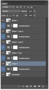
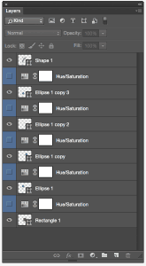
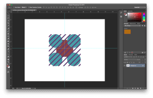
During the course of a single illustration, I can quickly build up a lot of these blue layers. You know what isn’t fun—hiding each blue layer so I can see my final illustration. That’s where a script can be really useful. Let’s hide all those blue adjustment layers. I’ve created a little example Photoshop file with some layers containing simple shapes for demonstration.

image_before_scripts

When scripting for Photoshop there is a general hierarchy to follow—like an organizational chart or inheritance tree. For a full look at the tree, you can check out Adobe’s own scripting overview.

At the top of the tree is the application (Photoshop). With JavaScript you don’t need to specify the application, so I will ignore setting that explicitly. Below the application you have the document. Like in the Adobe documentation, I’m going to set a variable named docRef equal to my active document.
var docRef = app.activeDocument;

Below the active document, you can target a lot of different things. For my simple script, I want to target those adjustment layers. According to the Adobe docs, “Photoshop has two types of layers: an Art Layer that can contain image contents and a Layer Set that can contain zero or more art layers.” I actually don’t need to work with a layer set in this example, so I can focus on the art layers.

Layers are numbered using a zero indexed array with the top most layer being zero. Be careful here. The names of layers in your layer stack do not correspond to the layer numbers in your script. For example, your top-most layer might be called “Layer 3” or “Background copy,” but it will still be layer zero when you reference it in your script. That means my first adjustment layer to hide will be at index one (the layer right below my top layer). I know that the adjustment layers will be every other layer, so I can increment by two, starting with layer one. This seems like a good candidate for a for loop.

Building a Function

Let’s create a function that will hold the for loop and hide the layers over which the loop iterates. I’ll call the function hideBlueLayers. Again, I’m going to write all of this in my text editor, and I’ll load the script to Photoshop when I’m happy with the final code. Also, don’t worry if you get errors or unexpected behaviors. You can undo and step backward from running a script just like you can undo any other Photoshop operation.

function hideBlueLayers(){

}

Looping over The Layers

Inside my function I’ll build my for loop. Remember, because of the order in which my action creates layers, I know that my top-most adjustment layer is the second layer from the top of my layer stack, so it’s layer index one. My adjustment layers then follow every other layer after that, so I can increment by two. I’ve set the active document to my docRef variable, and Photoshop provides “layers” to iterate over like any JavaScript array. That means I can use layers.length to set the end of my loop. My for loop looks like this:

for (var i = 1; i < docRef.layers.length; i+=2){

}

Hiding the Layers

Now I tell Photoshop that those layers should be hidden. I do this by setting the visible property to false on each of the layers iterated over by my loop.

docRef.layers[i].visible = false;

That’s it. The complete function looks like this:

function hideBlueLayers(){
    for (var i = 1; i < docRef.layers.length; i+=2){
        docRef.layers[i].visible = false;
    };
}

Now I can call that function at the bottom of the script.

hideBlueLayers();

Loading the JavaScript into Photoshop

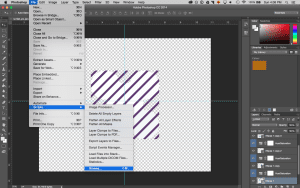
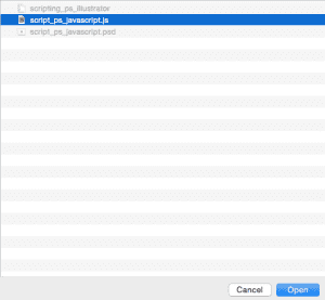
Let’s load this into Photoshop and see how it does. In Photoshop, I will go to File>Scripts>Browse and browse to my script. I select it and hit open. The script should now run.

browse_ps_dialogue

browse_file_location

Hey! Success. About 10 lines of code, and we have something useful—albeit simple.

layers_visible_true

layers_visible_false

Save a flattened version of the file as a PNG.

Building The Second Function

OK, but now I have a bunch of hidden blue layers that I don’t need. What if I want to take this a little further? At this point in an illustration, I have usually refined the art to the point that I’m ready to prep it for vectorizing or final inks. Let’s say I want a tidy PNG to bring into Illustrator for vectors. Wouldn’t it be nice if my script also flattened my layers and saved a PNG? Lets try it out. I’ll create a function called flattenSavePNG.

function flattenSavePNG(){

}

First, I want to save a version of the file as it is. If I want to make some changes later, I don’t want to lose all my layers, so I’ll save the file before flattening.

docRef.save();

This line will throw an error if you have not saved the file you’re working on at some point in the past. However, if you get this far on a project without ever saving I would be surprised.

Flattening the Layers

Now I want to flatten the image. Conveniently, Photoshop gives us a flatten method for just this. I’ll add it after my save.

docRef.flatten();

Saving the PNG

So far, so good. Now let’s save the PNG. For this I need to create a few variables, and I’ll put them at the top of my function for organization. I need a variable to set the file name of the PNG (I want it to be the same name as my PSD), a variable to hold the path of my file (I also want this to be the same as my PSD), and a variable to combine those for the output of my final PNG file. I’ll do that like this:

var pngName = docRef.name;
var savePath = docRef.path;
var fileLocation = File(savePath + "/" + pngName);

Now I need to call the saveAs method to save my PNG. SaveAs takes a few parameters. The first is where we want to save the “File,” which we set in our fileLocation variable, so we can pass it that.

docRef.saveAs(fileLocation);

Adobe also provides save options for different file types. For PNG I can set compression, interlacing and the typename. You can see all the different options in the Adobe docs. I’m not worried about changing the defaults for my PNG, so I’ll just pass it PNGSaveOptions. I can also set whether or not I want to save the file as a copy, which I’ll set to true. Lastly, I have three options for how to include the file extension: LOWERCASE, NONE, UPPERCASE. I like my file extensions lowercased, so I’ll set that. The final saveAs line looks like this:

docRef.saveAs(fileLocation, PNGSaveOptions, true, Extension.LOWERCASE);

The whole function looks like this:

function flattenSavePNG(){
    var pngName = docRef.name;
    var savePath = docRef.path;
    var fileLocation = File(savePath + "/" + pngName);
    
    docRef.save();
    docRef.flatten();

    docRef.saveAs(fileLocation, PNGSaveOptions, true, Extension.LOWERCASE);
}

Almost there. Let’s call this function and load the script into Photoshop just like last time (File>Scripts>Browse).

flattenSavePNG();

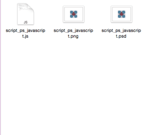
Hey, what do you know? The script flattened my file and saved a PNG.

image_after_scripts

png_created

I can include both these functions in one script and run all those steps each time I need the functionality – hide the blue layers, flatten the image, save my PSD, and save a PNG copy.

What else can you do?

Now, I could do a lot more than this. I should check to make sure that the PNG file doesn’t already exist before overwriting it. I could save a PNG, TIFF, and BMP all at once. I could even save each layer as a separate file rather than flattening the image.

You can also simplify some of the artistic processes in Photoshop such as adding borders, rotating objects precisely, and more. The example here isn’t meant to be exhaustive, and it probably differs from your Photoshop workflow (I don’t imagine you’re actually flattening things and saving PNGs for Illustrator). But I hope you see some possibility in what scripting offers.

Maybe you’re intrigued, but you don’t know any JavaScript. To be honest, the amount of JavaScript you need to get going is minimal. A quick trip through JavaScript Basics and JavaScript Loops Arrays and Objects here on Treehouse is more than enough knowledge to up your Photoshop game.

You may have no desire to program for the Web or to create applications. Coding will still help you excel at the things that do get your gears turning. Adobe is hardly the only company to offer the ability to script its programs. Many 3D applications allow you to write scripts with the Python programming language. There are so many ways to let a little code do the boring stuff, so you can stay focused on what makes your design and art creative and unique.

The post Learn JavaScript and Up Your Photoshop Game appeared first on Treehouse Blog.
6 Design Courses to Get Your Creativity Flowing

$
0
0

Do you have a great idea for an app or website, but are completely lost when it comes to the layout and look? Treehouse has some great courses to get you started in design and courses on tools that help you along the way. Put your design hat on and check out these courses for creativity and inspiration.

Start learning to code today with a free trial on Treehouse.

1. Web Design Process

Going from a blank screen to a finished website can be daunting. In this course with Nick Pettit, you’ll learn about the major steps involved in designing websites. We’ll learn how to gather information, explore potential concepts, and iterate on a design. By the end, you’ll have the foundation you need to continue your design journey.

Check out the course here

2. Digital Media Through Photoshop (newly released!)

photoshop

Get started with creating your own digital media files. Setting up your documents properly before you start creating will be crucial for your end product. In this course with Shon Dempsey, we’ll learn what those considerations are as well as how to choose the right options. We’ll introduce the most prolific creative application Photoshop to set up our files, make some adjustments and come out the other end with a banner ad suitable for use on the the desktop and mobile as well as print. This course is perfect for anyone looking to get started with design or photography.

Check out the course here.

3. Adobe Illustrator for Web Design

Using a project-based learning approach to Illustrator’s core features, walk through the process of designing a simple website beginning with making a wireframe, and then using that wireframe as the basis for creating a page mock up for mobile and desktop platforms. Along the way, use the basic drawing and shape tools to create an illustrated graphic logo. And with responsive web design in mind, we’ll utilize the benefits of both scalable vector graphics (SVGs) and CSS export capabilities.

Check out the course here

4. Prototyping in the Browser

prototyping-nick

Before you design a website, it’s important to have some kind of a plan or a wireframe to guide your efforts. But sometimes when you go from a simple sketch to digital pixels, the results aren’t exactly what you expect. When you work with real HTML and CSS, and you’re able to see your site on a real screens, you’re able to see a more accurate representation of the final result. In this course, we’re going to build a website prototype using the Bootstrap web framework.

Check out the course here

5. Bootstrap 4 Basics

Go more in depth with Bootstrap in Guil Hernandez‘s latest refresh. You’ll learn to use the latest in Bootstrap 4, one of the most popular open source front end frameworks, to help you build a functional design and layout in little time.

Check out the course here

6. Prototyping with Figma (newly released!)

In this course with Nick Pettit, you’ll learn how to build interactive and sharable prototypes in Figma, a web-based visual prototyping tool. You’ll create a prototype for a “prosumer” mobile photography app, and by the end, you’ll have a better understanding of how to create interactive prototypes that can be shared with project stakeholders and team members.

Check out the course here

The post 6 Design Courses to Get Your Creativity Flowing appeared first on Treehouse Blog.

8 New Courses for Developers & Designers

$
0
0

Each week Treehouse updates the library with new courses and workshops so that our students can continue their learning and stay up to date on the newest technology and languages. November was an exciting month as we released new design courses, a new language, and the completion of a brand new track. Data Analysis Basics is last course to complete our brand new Beginning Data Analysis track. Introduction to GraphQL is a brand new query language that can help simplify your workflow and compose more robust APIs. Check out the complete list of new courses below and explore learning something new!

Start learning to code today with a free trial on Treehouse.

1. Data Analysis Basics

screen-shot-2017-07-16-at-9-17-10-pm-1

Learn how to make better decisions with data in this course on data analysis with Ben Deitch. We’ll start by looking at what data analysis is, and then we’ll see how we can use data analysis to create better outcomes.

Check out the course here

2. Build a Selfie App

In this course with Pasan Permaratne we’re going to build an app that is quite popular these days – a selfie app! We’ll learn how to build and apply filters, how to use Core Data for more than just a single entity and how to use the device’s camera to create a fun app!

Check out the course here

3. Introduction to GraphQL

screen-shot-2017-11-16-at-12-38-23-pm

Simplify your backend with GraphQL, the new query language and runtime that is taking the world by storm. With GraphQL, it’s no longer necessary to resolve a bunch of different REST endpoints to get a complete chunk of data. We can use GraphQL to tell a server which data we want, and exactly what it should look like. Whether you’re a front-end developer looking to simplify your workflow, or a back-end developer looking for a way to compose more robust APIs, this course with Isaac Lee Morris is the perfect place to start.

Check out the course here

4. Digital Media Through Photoshop

Get started with creating your own digital media files. Setting up your documents properly before you start creating will be crucial for your end product. In this course with Shon Dempsey,  we’ll learn what those considerations are as well as how to choose the right options. We’ll introduce the most prolific creative application Photoshop to set up our files, make some adjustments and come out the other end with a banner ad suitable for use on the the desktop and mobile as well as print. This course is perfect for anyone looking to get started with design or photography.

Check out the course here

5. Prototyping with Figma

In this course with Nick Pettit, you’ll learn how to build interactive and sharable prototypes in Figma, a web-based visual prototyping tool. You’ll create a prototype for a “prosumer” mobile photography app, and by the end, you’ll have a better understanding of how to create interactive prototypes that can be shared with project stakeholders and team members.

Check out the course here

6. Active Record Associations in Rails

Most of your Rails models are going to be connected to other models in some way. An Author has many Articles, and each Article belongs to an Author. A Doctor has many Patients, and a Patient may have many Doctors as well. Rails uses associations to make it easy to track these relationships in your database. Learn about Active Record Associations in Rails in this course with Jay McGavren.

Check out the course here

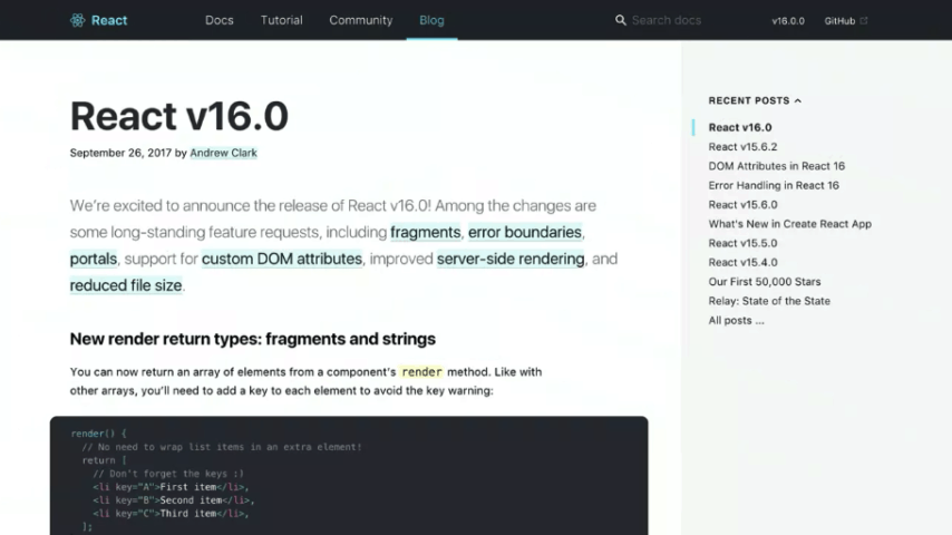
7. What’s New in React 16

react16

The new core architecture of React 16, codenamed “Fiber,” introduces lots of new, highly anticipated features and improvements to React. Get up to speed with new features in React 16 in this workshop with Guil Hernandez.

Check out the course here

8. Java Arrays

Arrays are container objects that can be used to store multiple values. In Java Arrays, we’ll talk all about what they are, how to create them, as well as why and when you should use them. Check out this course taught by Craig Dennis.

Check out the course here

Coming soon!

Build a Chatbot with Watson APIs

IBM has created an AI platform named Watson that gives businesses and developers access to powerful tools for text and speech analysis, computer vision, and more. Watson APIs consist of a suite of services used to process or analyze data to answer questions and make decisions. This course will show you how to build a chatbot with Node.js and Conversation services from Watson. You’ll also learn how to setup and deploy your bot on IBM’s Cloud platform.

Check out the upcoming course here

These are just a list of courses released this month. Our Treehouse Library currently has over 300 courses and workshops for you to check out!  Do you have a Treehouse favorite? Let us know in the comments below!

6 Design Courses to Get Your Creativity Flowing

The post 8 New Courses for Developers & Designers appeared first on Treehouse Blog.

Responsive Web Design in the Browser Part 1: Kill Photoshop

$
0
0

If you’re like me, then you’ve had a love/hate relationship with Photoshop for almost a decade. The software is bloated, it crashes right at the moment you forgot to hit save, and it produces a design that is nothing more than a useless and non-functioning image to send to clients. Despite loathing the software that is the staple of our industry, we can’t live without it. High fidelity mockups have spoken in a way that we just can’t beat with any other applications… until now. Let’s explore the next stage in the evolution of the web and one where Photoshop is a waste of our valuable time. Here’s how to kill Photoshop and do responsive web design in real-time with the only app we need: the browser.

Why Kill Photoshop?

1. It’s Double the Work.

The main reason to kill Photoshop is because it doubles or even triples your current workload. You can spend hours of your precious time inside of Photoshop and what do you get? A picture.

2. Clients Can’t Use It.

This brings me to my second point. Photoshop produces a mockup that clients simply can’t use. To quote Steve Jobs, “Design is how it works”, and if your clients can’t use what you’ve built then you’re missing a huge piece of the puzzle. Once your clients get to use your design and they find that it doesn’t work for them, if you’ve used Photoshop you’re back to square one.

3. You Can’t Make Changes Live.

If you’re designing in the browser you can make changes to your design in real-time. Let’s say you have a client drop in the office and they want to change the color of the main headline (or gasp, the size of the logo), but they’re not quite sure what color they want it to be. You launch your browser with a single tool (more on this later) and iterate as many colors quickly to find the perfect shade of light-ish, aqua-ish, color of my second wife’s Mercedes, blue. (you know exactly what I mean)

Firebug to change colors
Client wants a red headline? Who needs Photoshop when you can make changes live in Firebug?

4. CSS is Ready.

For years there were certain things that we needed Photoshop for that CSS just couldn’t do. These included things like buttons, shadows, borders, etc. Now that CSS is all grown up, we can do many of the stylistic elements that we crave in CSS, and Photoshop is needed less and less with every new release.

5. Photoshop is Expensive.

Part of the beauty of the web is that it’s income-agnostic. Anyone can get into web design with a basic PC (gross) or an older model of Mac (yum, that’s better). The problem for years has been that you needed a machine that could handle the load it required for the latest version of Photoshop that you had to mortgage your home to get in the first place. You can keep from having to sell your little sister to buy Photoshop now that you can design straight in the browser.

6. Photoshop is Static.

Now that we’ve established that Responsive Web Design is the future of the web, why spend time designing a website in Photoshop that isn’t fluid? If you feel the urge to design each breakpoint (where the Responsive Design breaks) in Photoshop, then return to my first point and change “Double the Work” to “Six Times the Work”.

Photoshop Workspace
Working inside of Photoshop only gives you an image that clients can’t use.

7. Photoshop Has No Prototype Value.

Sure you can prototype the look of a website inside of Photoshop, but you can’t iterate on the fly. The new evolution of the web places an enormous value in the ability to let a design evolve with use. Designing in the browser also affords you the luxury of creating multiple style sheets for your markup to drastically change the look and feel of your site with just a few changes in the style sheet link. From there, you can again fine tune your design live to really hone in on what the client wants.

8. You Start with Content, Not Style.

A good web designer understands the holy grail of designing for the web: great markup. Content out or the content first approach to design isn’t just a fad, it’s gospel. In his famous article, The Web is 95% Typography, Oliver Reichenstein of Information Architects, argues:

“95% of the information on the web is written language. It is only logical to say that a web designer should get good training in the main discipline of shaping written information, in other words: Typography.”

information architects
Oliver Reichenstein argues that the web is 95% Typography.

It’s important to note that “shaping written information” refers to style, but my point here is that if the content that you use is 95% of your design, then the majority of your time in Photoshop is wasted on 5% of a great design. In that light, you’re also spending that time in the wrong order. Designing your content first and coding semantic, standards-based markup is the foundation of a great design and not something you approach as an after thought of Photoshop. Having this markup first allows you to iterate your styles quickly without having to reinvent the wheel every time you make a change.

Conclusion

The next era in designing for the web is a more advanced, mature and intelligent one. It’s about streamlining, semantics, great markup, responsive or fluid design, great typography, web fonts, content first, rapid prototyping and advanced javascript. My argument is that html, CSS and the browser tools we need have all advanced us past the point of needing Photoshop. If you want to be a great designer moving forward, I would start thinking about “Killing Photoshop”. …and here’s a bonus reason to kill Photoshop: no more spinning beach balls! In part 2, we’ll take a look at the tools you’ll need to start your new strategy for responsive web design in the browser.

The post Responsive Web Design in the Browser Part 1: Kill Photoshop appeared first on Treehouse Blog.

Responsive Web Design in the Browser Part 2: The Tools

$
0
0

Now that we’ve killed Photoshop, we need to get into the nitty gritty of how to still make a living without our favorite, yet most frustrating app. After all, talking about what’s broken without offering a solution doesn’t do anyone any good.

In this second installment of Responsive Web Design in the Browser, I want to talk about what I use everyday to try and escape the gnarly grasp of the Photoshop beast. It’s not a perfect system yet, but it’s getting better everyday. I hope this gives you a starting point and a few resources to develop your own process for designing in a post-Photoshop world.

Important note: You may be a designer that designs only in Photoshop and you’ll argue that this article suggests that all designers should code. Honestly, that’s exactly what I’m proposing. We’re talking about web design and to me it makes more sense to use the web to design than using an image editor.

Here’s my process for designing without Photoshop:

1. Choose Your Text Editor.

The text editor is by far the most important tool for the web designer. It’s the lifeline app that we absolutely can’t live without, not Photoshop. Although everyone with a computer has access to a free text editor, there are three main editors that seem to currently be the most popular.

Sublime Text

sublime text
Sublime Text 2 is the most widely used among our Treehouse team.

If you’ve watched any of the most recent Treehouse Tutorials, you’ll notice that the designers (and developers for that matter) on the teaching team have all been using Sublime Text 2. It’s a clean text editor with much of the functionality you need, while getting rid of the stuff you don’t.

Coda 2

coda 2
Coda 2 from Panic is a great editor for designers and works great with Transmit for ftp.

Coda 2 is the latest installment from Panic. It has many extra great features and works nicely with a built-in ftp functionality that lets you quickly upload your files to your server. It’s important to note as well that many designers prefer Coda because the interface has a much more “designed” feel to it.

Textmate

Text Mate
Text Mate has been a go to editor for designers and developers alike.

Textmate has been the stripped-down text editor that many people have loved for years. It’s simple, yet gives you the color differences and collapsing that you don’t get with the free editors.

2. Create Your Markup in HTML.

A great design should start with the content. Although getting content from a client is harder than getting them to approve a Photoshop mockup, designing from the “content out” gives you the basis you need to decide the approach you want to take. How can you design the best solution when you’re not sure of what needs to be said? Our jobs as designers are to be great communicators and establishing what the client wants to say is a great place to start.

Once you’ve got your content, mark it up in html using the best practices of creating great, semantic markup. Make sure your markup is completely accessible to those that have disabilities as well as making it ready for readers like Instapaper or Readability.

3. Create Your CSS Reset and Stylesheets.

Now that you have the html structure of your website, decide on the best CSS reset so that you eliminate all of the built-in styling from the individual browsers to give yourself full control of your styles.

Once I’ve decided on a reset, I usually create multiple stylesheets in my text editor, with media queries at popular breakpoints, and save them. I create multiple stylesheets like most people create multiple mockups in Photoshop. All of have to do to show a client a different look is change “style1.css” to “style2.css” in the link in the head tag of my html document. Once they’ve decided on which look they like, we can work together in the browser to make the final tweaks. For now, we’re just setting it up so we have this ability once the design is complete.

The Magic Equation for Responsive Images
The Magic Equation for Responsive Images will be set by your baseline CSS reset.

Once I’ve got my stylesheets created, I usually hop on over to Colour Lovers or Kuler to find a color palette I like based on the colors from the client’s logo or branding guidelines. Then I place the color values in the comments atop the CSS file so I have them for reference throughout my design process.

4. Upload and Hookup Your Javascript and jQuery.

The next step in our setup is to define the different types of Javascript files we want to use for our project and make sure that they’re loaded and the scripts are placed in our code to “hook them up”. Here are a few of the Javascript files I’ve used on multiple projects:

FitVids.js

fitvids.js
FitVids, from the lads at Paravel, Inc, is the best plugin I’ve found for creating responsive videos.

If you’re going to be using video in your design, FitVids.js from Paravel is a must have. You’ve likely encountered this plugin on just about every responsive site you’ve visited lately. I don’t know what I would have done without it.

FitText.js

fittext.js
FitText.js, also from Paravel Inc, makes sure that your headlines always look good.

FitText.js is another Javascript plugin from Paravel that allows you to create fluid headlines that fill the container that you’ve given them. It leads to a better design and one that doesn’t look broken at certain break points.

Respond.js

What would web design be without having to look out for other browsers? Even more than Photoshop, this is probably the biggest frustration in the world of web design. Luckily, there are genius people out there that create great Javascript like Respond.js to take care of the browser support for us.

5. Open Your Browser of Choice.

In order to design using the browser, we’re going to have to pick one, naturally. The big three are Safari, Chrome and Firefox. Designers typically choose one based on their own preferences or biases, but all three are great and have their own developer tools.

Firebug

Firebug
Firebug is a developer tool you can use with Firefox to tweak your CSS live in the browser.

One of the great things about designing with Firefox is the Firebug developer tool. I’ve used this one for a long time and have had a great time using it to design in the browser.

6. Know The Magic Equation.

the magic equation
The Magic Equation for turning pixels into percentages in responsive web design.

The most important key in Responsive Web Design is knowing the magic equation. This isn’t necessarily a post on how to do Responsive Design so I won’t go into great detail here, but knowing how to convert pixels to ems and percentages is absolutely vital.

7. Build Your Fluid Grid.

Gridset

Gridset App
Gridset is a web app developed by the team at Boulton Design to help you create the perfect grid.

Gridset, the great new tool from Mark Boulton and the awesome crew at Boulton Design, will allow you to build the perfect responsive grid for you new project. I’ve used it a lot lately and recommend it to anyone looking to experiment with different grids. It also allows you to save grids from other projects for future use.

Frameworks

If starting your grid foundation from scratch isn’t for you, then Bootstrap, Foundation, and Skeleton are a just a few of the Responsive CSS frameworks that are available to you. They come complete with grid structure, content layout, and built-in CSS for buttons, etc. Frameworks enable you to get off the ground and running even faster, and they have a structure that has been proven over and over again to be reliable and flexible.

8. Set Your Fonts, Type and Layout.

Now that you’ve got your basic grid laid out, it’s time to consider how you will structure and style your text. Knowing what your reader’s needs are, and then designing the proper content structure for them, will lead to the best product possible.

Typecast

typecast
Typecast allows you to try different fonts, font sizes, line heights and layouts in real-time.

I’ve had the great pleasure of using a new web-based tool for designing content-first layouts called Typecast. Rarely have I ever had so much fun using an app to set type and content style.

Using the fonts from the great web font services like Typekit, Fonts.com, Font Deck, and Google, you can use Typecast to see how your fonts will look in real-time and right there in the browser. It’s amazing and you’ve got to check it out. It’s currently in beta, but after they personally took me through the app, I see it as being a huge game-changer.

9. Test, Test, Test.

Since Responsive Web Design has gained so much traction, that means that people everywhere are creating great Javascript to aid in its growth. A few websites you can use to test your designs in the browser are Responsinator, Responsive.is, and Responsive Design Testing, just to name a few.

10. Edit Your Images.

Here is one of the biggest challenges facing a world without Photoshop. We still have to take care of crafting and preparing our images. Luckily, we have new alternatives such as Acorn that are less expensive and a lot less bloated. Also, if you’re on a tight budget, you can just Google free online image editors and pick the one you like the most.

Conclusion

I know that this topic is a sensitive one. For years designers have used Photoshop to push our craft forward. I’m not so naive to think that Photoshop will disappear overnight, but I wanted to show you, our great reader, that the future of Web Design is upon us.

Two great strategies, Designing in the Browser and Responsive Web Design are both here to change our industry and change the way we work. I hope this article opened your eyes to some new possibilities and some new tools. Go forth and create, but do it in the browser!

Test out these strategies and tools, decide what works for you, and write me to tell me about it. I can’t wait to hear how it goes…

The post Responsive Web Design in the Browser Part 2: The Tools appeared first on Treehouse Blog.

Quick Tip: Using Brushes & Patterns in Photoshop

$
0
0

In this Treehouse Quick Tip, Allison Grayce teaches us how to load and use brushes and patterns in Adobe Photoshop. Allison is a web design teacher at Treehouse. From brand strategy and user interface design to creative writing and front-end development, she has a passion and appreciation for complete brand experiences. Allison holds her BFA in Web Design & Interactive Media. Twitter: @allisongrayce.

If you enjoyed this video, be sure to check out Treehouse, the best way to learn about web design, web development, business, and mobile apps.

Other topics on Treehouse include topics like …

Video Transcription

Hi, I’m Allison Grayce. In this Treehouse quick tip, we are going to learn
how to load and use brushes and patterns in Adobe Photoshop.

I am looking to use some brushes in my design using texture and grunge.
There tons of brushes and patterns on the Internet that you can find, but
I’m going to find my favorite brushed by Liam McKay, function subtle grunge
brushes. I am going to go ahead and download them form Designmoo, which I
will link to in the description box.

Go ahead and extract the zip folder, and inside should be an ABR file. Copy
that file, go ahead and navigate to applications, Adobe Photoshop CS6, in
my situation. Click on presets, brushes, and go ahead and go ahead and
paste the ABR file into this directory. The brushes already in here are
Adobe’s default brushes.

So you can go ahead and close the finder here and minimize your browser and
head back on over to Photoshop. Select the brush tool from your toolbar by
pressing B on your keyboard, or just clicking on it in your toolbar.
Navigate to your options bar and click the drop down arrow. Go ahead and
click the gear button here, or in your case, depending on which version of
Photoshop you’re using, this might be an arrow and click replace brushes.

We’re going navigate to the directory, where we paste our ABR file and we
are looking for function subtle grunge. Go ahead and click open, your new
brushes will now appear in the scrolling area in the drop down menu of the
options bar. Go ahead and select one of the brushes. I am going to add a
mask to the shape that I want to apply the texture to. To preview the
brush, press the caps lock button on your keyboard.

So I am going to head on over to the layers panel and add a mask that I
want to add texture to. In this case I am going to add texture to the grey
circle. So go ahead and press the add layer mask button right here and
making sure you have black as your foreground color, go ahead and click on
the canvas to apply the texture. You can just click around to add more
texture, press control Z to undo the texture. It’s really just a matter of
experimentation.

I think that looks pretty good. Now I want to add texture to the
background. I want this texture to be a repeating pattern. My favorite
tile wall patterns are from Tileables, and I am going to navigate to their
website and download a repeating paper background. You can either download
the entire pack here, or you can just click on one, open image in the new
tab. I am going to copy this image, bring it back into Photoshop, create a
new document and paste the image.

Now that I have the tileable image, it’s time to define it as a pattern.
You do so by going to the menu bar at the top and pressing edit, define
pattern, and feel free to name this pattern as you wish. I am going to make
this document a little bit larger. You can delete the solid color
background, create a new layer, making sure that layer is underneath the
circle.

Go ahead and choose the paint bucket tool from your toolbar and navigate on
up to the options bar. Click the drop-down menu next to the thumbnail here,
and you will see your new pattern. Go ahead and select that and you can
click on the canvas and we are done.

By using brushes and patterns we’ve pushed this design to the next level.
Now that you know how to load and use brushed and patterns in Photoshop,
the endless looks you can achieve with these tools are only limited to your
imagination. Using these tools will create a tactile and artistic feel,
setting your design apart from the rest.

[Recording: If you would like to see more advanced videos and listen to
more videos like this one, go to teamtreehouse.com and start learning for
free.

The post Quick Tip: Using Brushes & Patterns in Photoshop appeared first on Treehouse Blog.

What to Do When You Can’t Design in the Browser

$
0
0

How it used to work

In the past, once we were given website content by the client or project manager, we’d move forward with a digital wireframe or sketches. We may have even made those wireframes interactive using great resources out there like MockingBird or InvisionApp. Later we’d design every last detail in Photoshop down to the kerning on type, and border-radius’ on buttons. Usually after a series of revisions, the approved design would be sliced up, coded and tweaked it until it looked just like the comp. And finally, when it looked exactly the same in every browser, we’d launch it.

The problem with this process

Unfortunately as web designers & developers (but fortunately as consumers), we don’t just have a couple types of mobile devices and a handful of screen resolutions anymore. Mobile websites aren’t seen as a secondary or additional website to the desktop version. They are now seen as one. We live in a world with tons of different devices and resolutions, and new ones coming out everyday. We should be happy with this forward movement in technology… right?

Well… it’s kind of thrown a wrench in our process. Showing the client a high fidelity 980px wide comp isn’t the best deliverable anymore. Right off the bat it this sets false expectations. But is designing a tablet and mobile equivalent of the same site really an option? No. That would take forever. So how can we evolve our process moving forward to accommodate for the responsive web?

“Design in the browser!”– Awesome people in our industry

Many leaders in the industry have advocated designing in the browser. And I get it. It makes total sense. The father of Responsive Web Design himself, Ethan Marcotte, refers to static comps during the responsive design process as a “catalog of assumptions”. Meagan Fisher wrote a great article back in 2009 and quoted her then boss, Dan Cederholm – “a website’s design should begin where it’s going to live: in the browser.” And our very own Josh Long recently wrote a really convincing article about why we should kill Photoshop.

Why I can’t do it

I’ve found it really difficult to adapt this way of design. Maybe it’s because I’ve always considered myself to be a designer first, and a developer second.

When I’m in Photoshop, it’s a blank canvas where me and my right brain are free to explore all sorts of creative UI solutions without the distraction or limitations of code. Do whatever I want and figure out how to make it work later on. Diving right into code for me personally, has a couple of negative consequences – the design ends up being sterile, too simple, and nothing exceptionally innovative. It’s also way too much commitment. Early on in my design process I like to rapidly prototype, move things around and try different things. I keep building and moving things around until I like it and want to commit to making it a reality in code.

Okay so maybe I’m a little obsessive compulsive. I don’t like the idea of letting go – but that’s what we need to do. I see Responsive Web Design as the final push to let go of some of this control we as designers have tried to hold onto, in an era where it’s just no longer possible.

Moving Forward

So for those of us on the same page, how do we move forward? How to we evolve our process for responsive web design? While it’s still something I’m trying to nail down myself, I thought I’d share with you the direction I plan on heading.

Sketch

This is a step for me that will never go away. But it can evolve. Instead of using my beloved UI stencils browser sketch pad, it’s time to invest in a few of AppSketchbook’s responsive design sketchbook. For days when I’m feeling less fancy, I’ll simply draw out a few breakpoints in my Whitelines sketchbook. Thinking about how breakpoints will affect your layout early on in the design process will make things easier for you later on.

Wireframe

Once I’ve nailed down my layout, I’ll take it a step further and wireframe the actual content around a grid at various breakpoints in either Illustrator or Photoshop. Here, I can begin playing around with fonts, button styles, and begin developing the UI – making sure to avoid too much detail to save time.

Smells Like Bakin'  Wireframe
Smells Like Bakin’ Wireframe

Leaving detail out also allows the client to focus on the content itself, instead of the decoration around it.

UI Style

This is where the big change takes place. Instead of moving forward with the wireframe and designing a full-fledged mockup which is too precise, or gathering inspiration for a traditional moodboard which is too vague, I’ll use something like Samantha Toy’s “Style Tiles” to create a visual design for the brand.

Smells Like Bakin' Styles
Smells Like Bakin’ Styles

It’s much easier to create a series of these “UI moodboards” than go through several revisions of detailed mockups.

Code

Now that we have a layout nailed down, a clear direction for the user interface, and an idea of how our website will break down, we can confidently move forward with the code.

Conclusion

With this new process, we’ve solved most of our issues here with designing in the browser. I feel like it’s a happy middle ground to saving time and energy that Photoshop has cost us in the past, without sacrificing the creative aspect of designing a website. It will still be a big change, but a bit less drastic than completely killing off Photoshop and diving right into code.

It all comes down to what works best for you and your company. There’s no right or wrong process, it’s just about finding one that’s most efficient for you.

The post What to Do When You Can’t Design in the Browser appeared first on Treehouse Blog.


Quick Tip: How to Achieve Pixel Perfection in Photoshop

$
0
0

In this Treehouse Quick Tip, we’re going to learn how to deal with unwanted anti-aliasing in Photoshop and achieve pixel perfection when working with vector shapes. This method is referred to as pixel-hinting.

Using Adope Illustrator and Photoshop, you can apply pixel hinting to your vector shapes to get exactly the design you are looking for.

Video Transcription

Allison: Hi, I’m Allison Grace. In this Treehouse Quick Tip were going
learn how to deal with unwanted anti-aliasing in Photoshop
and achieve pixel perfection when working with vector
shapes. This method is referred to as pixel hinting. In
this quick tip I’ll be using Adobe Illustrator CS6 and
Adobe Photoshop CS6.

Now I’ve gone ahead and created a simple logo in
illustrator and I want to bring that logo to use in a
design I’m working on in Photoshop. So, Control+A to select
all, then Control+C to copy and let’s navigate on over to
Photoshop. So, let’s go ahead and Control+V to paste the
logo.

Photoshop gives us a dialog box that asks how we want to
paste in our vector shape. Since we want to be able to edit
the paths, we’ll paste it in as a shape layer. So, I’m
going to go ahead and scale the logo to my desired size,
because if I resize the shape after pixel hinting I’d need
to do it all over again. We’re going make this logo white,
perfect.

So, let’s go ahead and zoom in a little bit closer here. If
you notice, there is some unwanted anti-aliasing happening,
especially around these horizontal lines here. What that
does, if we zoom back out is it actually makes the logo
look a little bit blurry. This happens to a lot of vector
shapes because the paths are not completely taking up one
whole pixel. They’re taking up a little more or a little
less. Sometimes for it to appear perfect we’ll need to
adjust the shapes.

Now, in CS6 we’ll need to head to Photoshop, Preferences,
and General, and head on over to the very to the very last
check box here and uncheck Snap Vector Tools and Transform
to Pixel Grid. Press Okay. Turning this option off will
let us manually adjust where the paths fit into Photoshop’s
pixel grid. You’ll want to turn it back on if your drawing
shapes in Photoshop later.

So let’s go ahead and right click and select the shape. We
can see the paths that make up the vector shape now.
First, let’s go ahead and zoom in on the icon here. As you
can see this part of the paper airplane is not a perfectly
straight line and because of this, it’s causing some
fuzziness in the logo.

So, if we navigate over to the toolbar and select our
direct selection tool, we can grab the anchors on our path.
Then we can use our right arrow to nudge it to the right.
We can see now that the line is beginning to appear
sharper. We’ll do the same thing with this anchor.

Now, let’s move on down to this horizontal line here. Click
on the top left and top right anchors of this line,
remembering to hold shift, and let’s go ahead and use the
bottom arrow on our keyboard to nudge it down. For the
bottom left and bottom right anchors, we will nudge it up a
bit. So, if we zoom out we can see how much better our logo
is beginning to look. Moving down to the type, make sure to
be careful.

Text should and will have anti-aliasing, especially around
the curves where letters should appear smooth. So, only
adjust the areas of the vector shape that should have a
sharp clean edge. We’ll just fix the top and bottom of the
letters and leave the rest alone.

To move around the canvas when you’re zoomed in this close,
just hold down the space bar. So if we zoom out back to
100% we can see that our logo is very crisp and sharp.
Pixel hinting and snapping your vector shapes to grid will
result in a much cleaner, crisper design. Training your eye
to be aware of the overall design, down to each and every
pixel is what will set a good designer apart from a great
designer.

Announcer: If you’d like to see more advanced videos and tutorials like
this one go to teamtreehouse.com and start learning for
free.

The post Quick Tip: How to Achieve Pixel Perfection in Photoshop appeared first on Treehouse Blog.

How to Shape Text Fields in Photoshop | Treehouse Quick Tip

$
0
0

Have you ever wanted to give a text field in Photoshop an unusual shape? In this Treehouse Quick Tip, Photoshop teacher Allison demonstrates how to bend and curve a text field into whatever shape you need!

Video Transcription

Allison: Hi. I’m Allison Grayce. In this Treehouse Quick Tip, we’re
going to learn how to manipulate Photoshop’s Text Containers to
take on a more unconventional shape, because sometimes, a simple
box just won’t do. We’ll achieve this using vector shapes, the
Pen, and Type tool.

I want to add some paragraph text to the left of this cupcake.
Instead of the paragraph text simply being in the shape of a
box, I’d like the right side of the text to curve along with the
cupcake. I’m going to go ahead and grab the Rectangle tool, and
draw out the size of the paragraph. Head on over to the Pen tool
and click, hold, and select the Add Anchor Point tool. We’re
going to add a few points on the path where we’d like the Text
Box to curve. It can be helpful to lower the opacity of the
rectangle as you’re doing this.

Using the Direct Selection tool by pressing ‘A’ on your
keyboard, or by navigating over to the toolbar and clicking and
holding, move the anchors to position them where the text box
should curve alongside the cupcake. Remember, you can grab the
handles on either side of the anchor to get more of a curve
going.

Go ahead and select all of your text that you’d like to appear
in the text box. Select the Type tool, hover over the shape, and
when the cursor changes, go ahead and click. Notice how the text
box takes on the shape that we just manipulated. We’ll go ahead
and paste in our text and begin to style it appropriately. We’ll
go ahead and commit to our current edit here in the Options bar,
and we can delete the rectangle that we initially manipulated.
The right side of our text box now curves alongside the cupcake.
Now you have the freedom to manipulate the Type box to whatever
shape you want it to be.

Announcer: If you’d like to see more advanced videos and tutorials like
this one, go to TeamTreehouse.com, and start learning for free.

The post How to Shape Text Fields in Photoshop | Treehouse Quick Tip appeared first on Treehouse Blog.

Learn JavaScript and Up Your Photoshop Game

$
0
0

You’re a Photoshop master. You have your preferences perfected, the menus memorized. You’re a Wacom wielding wizard. Or are you? If you use Photoshop and you don’t code, you’re wasting time and effort with every project you touch. That’s time you could use to do more creative, enriching work or to get away from your desk entirely.

Adobe provides us the ability to automate tedious tasks and perform otherwise cumbersome chores by writing simple scripts. We can use AppleScript, JavaScript, or VBScript. In this tutorial, I’ll show you a few basic lines of JavaScript that will result in a useful Photoshop helper. By the end, you’ll have enough knowledge to investigate further and apply some basic scripting to your own projects. When you think of a repetitive task that takes the joy out of your design process, I hope you’ll stop dreading it and start automating it.

Why JavaScript?

I’m going to use JavaScript for a few reasons. First, JavaScript is cross-platform, so we can use it on both Mac and Windows. Second, JavaScript is everywhere. If you decide to take programming further (e.g. building your own website), you will be well-positioned by having JavaScript knowledge. Third, because JavaScript is so widely used on the Web, there are a lot of wonderful introductions to the language, including those here on Treehouse.

What about automating with Photoshop actions?

I know what you’re thinking—I can automate tasks using Photoshop’s actions, and I don’t have to write any code. You’re right . . . and you’re wrong. Actions are wonderful, and they are pretty powerful too. Scripting isn’t meant to take the place of actions, rather scripting is meant to enhance actions and provide functionality that actions cannot.

How do I add JavaScript to Photoshop?

To write scripts for Photoshop, Illustrator, or the other Adobe desktop applications, you can use the ExtendScript Toolkit that comes with Adobe CC. However, you are not required to use ExtendScript. You can write your code in whichever text editor you choose. The important part is that you save a file with the .js or .jsx file extension. There isn’t anything special about a script for Photoshop – it’s just a text file like any other JavaScript file. Once you write your code and save the file, you can browse to that file and load it into Photoshop, which I’ll show you in a little bit.

Let’s get started.

I have an action setup for when I’m illustrating. I pulled this handy action from “The DC Comics Guide to Digitally Drawing Comics”, by Freddie Williams II. It’s a helpful little book if you haven’t jumped into digital drawing yet. The action creates a new adjustment layer that colors all my line work below that adjustment layer a light blue. The action also creates a new layer above the blue adjustment layer. This allows me to quickly sketch and refine, because I can easily see the difference between my current layer and the previous work below that layer.

During the course of a single illustration, I can quickly build up a lot of these blue layers. You know what isn’t fun—hiding each blue layer so I can see my final illustration. That’s where a script can be really useful. Let’s hide all those blue adjustment layers. I’ve created a little example Photoshop file with some layers containing simple shapes for demonstration.

image_before_scripts

When scripting for Photoshop there is a general hierarchy to follow—like an organizational chart or inheritance tree. For a full look at the tree, you can check out Adobe’s own scripting overview.

At the top of the tree is the application (Photoshop). With JavaScript you don’t need to specify the application, so I will ignore setting that explicitly. Below the application you have the document. Like in the Adobe documentation, I’m going to set a variable named docRef equal to my active document.
var docRef = app.activeDocument;

Below the active document, you can target a lot of different things. For my simple script, I want to target those adjustment layers. According to the Adobe docs, “Photoshop has two types of layers: an Art Layer that can contain image contents and a Layer Set that can contain zero or more art layers.” I actually don’t need to work with a layer set in this example, so I can focus on the art layers.

Layers are numbered using a zero indexed array with the top most layer being zero. Be careful here. The names of layers in your layer stack do not correspond to the layer numbers in your script. For example, your top-most layer might be called “Layer 3” or “Background copy,” but it will still be layer zero when you reference it in your script. That means my first adjustment layer to hide will be at index one (the layer right below my top layer). I know that the adjustment layers will be every other layer, so I can increment by two, starting with layer one. This seems like a good candidate for a for loop.

Building a Function

Let’s create a function that will hold the for loop and hide the layers over which the loop iterates. I’ll call the function hideBlueLayers. Again, I’m going to write all of this in my text editor, and I’ll load the script to Photoshop when I’m happy with the final code. Also, don’t worry if you get errors or unexpected behaviors. You can undo and step backward from running a script just like you can undo any other Photoshop operation.

function hideBlueLayers(){

}

Looping over The Layers

Inside my function I’ll build my for loop. Remember, because of the order in which my action creates layers, I know that my top-most adjustment layer is the second layer from the top of my layer stack, so it’s layer index one. My adjustment layers then follow every other layer after that, so I can increment by two. I’ve set the active document to my docRef variable, and Photoshop provides “layers” to iterate over like any JavaScript array. That means I can use layers.length to set the end of my loop. My for loop looks like this:

for (var i = 1; i < docRef.layers.length; i+=2){

}

Hiding the Layers

Now I tell Photoshop that those layers should be hidden. I do this by setting the visible property to false on each of the layers iterated over by my loop.

docRef.layers[i].visible = false;

That’s it. The complete function looks like this:

function hideBlueLayers(){
    for (var i = 1; i < docRef.layers.length; i+=2){
        docRef.layers[i].visible = false;
    };
}

Now I can call that function at the bottom of the script.

hideBlueLayers();

Loading the JavaScript into Photoshop

Let’s load this into Photoshop and see how it does. In Photoshop, I will go to File>Scripts>Browse and browse to my script. I select it and hit open. The script should now run.

browse_ps_dialogue

browse_file_location

Hey! Success. About 10 lines of code, and we have something useful—albeit simple.

layers_visible_true

layers_visible_false

Save a flattened version of the file as a PNG.

Building The Second Function

OK, but now I have a bunch of hidden blue layers that I don’t need. What if I want to take this a little further? At this point in an illustration, I have usually refined the art to the point that I’m ready to prep it for vectorizing or final inks. Let’s say I want a tidy PNG to bring into Illustrator for vectors. Wouldn’t it be nice if my script also flattened my layers and saved a PNG? Lets try it out. I’ll create a function called flattenSavePNG.

function flattenSavePNG(){

}

First, I want to save a version of the file as it is. If I want to make some changes later, I don’t want to lose all my layers, so I’ll save the file before flattening.

docRef.save();

This line will throw an error if you have not saved the file you’re working on at some point in the past. However, if you get this far on a project without ever saving I would be surprised.

Flattening the Layers

Now I want to flatten the image. Conveniently, Photoshop gives us a flatten method for just this. I’ll add it after my save.

docRef.flatten();

Saving the PNG

So far, so good. Now let’s save the PNG. For this I need to create a few variables, and I’ll put them at the top of my function for organization. I need a variable to set the file name of the PNG (I want it to be the same name as my PSD), a variable to hold the path of my file (I also want this to be the same as my PSD), and a variable to combine those for the output of my final PNG file. I’ll do that like this:

var pngName = docRef.name;
var savePath = docRef.path;
var fileLocation = File(savePath + "/" + pngName);

Now I need to call the saveAs method to save my PNG. SaveAs takes a few parameters. The first is where we want to save the “File,” which we set in our fileLocation variable, so we can pass it that.

docRef.saveAs(fileLocation);

Adobe also provides save options for different file types. For PNG I can set compression, interlacing and the typename. You can see all the different options in the Adobe docs. I’m not worried about changing the defaults for my PNG, so I’ll just pass it PNGSaveOptions. I can also set whether or not I want to save the file as a copy, which I’ll set to true. Lastly, I have three options for how to include the file extension: LOWERCASE, NONE, UPPERCASE. I like my file extensions lowercased, so I’ll set that. The final saveAs line looks like this:

docRef.saveAs(fileLocation, PNGSaveOptions, true, Extension.LOWERCASE);

The whole function looks like this:

function flattenSavePNG(){
    var pngName = docRef.name;
    var savePath = docRef.path;
    var fileLocation = File(savePath + "/" + pngName);
    
    docRef.save();
    docRef.flatten();

    docRef.saveAs(fileLocation, PNGSaveOptions, true, Extension.LOWERCASE);
}

Almost there. Let’s call this function and load the script into Photoshop just like last time (File>Scripts>Browse).

flattenSavePNG();

Hey, what do you know? The script flattened my file and saved a PNG.

image_after_scripts

png_created

I can include both these functions in one script and run all those steps each time I need the functionality – hide the blue layers, flatten the image, save my PSD, and save a PNG copy.

What else can you do?

Now, I could do a lot more than this. I should check to make sure that the PNG file doesn’t already exist before overwriting it. I could save a PNG, TIFF, and BMP all at once. I could even save each layer as a separate file rather than flattening the image.

You can also simplify some of the artistic processes in Photoshop such as adding borders, rotating objects precisely, and more. The example here isn’t meant to be exhaustive, and it probably differs from your Photoshop workflow (I don’t imagine you’re actually flattening things and saving PNGs for Illustrator). But I hope you see some possibility in what scripting offers.

Maybe you’re intrigued, but you don’t know any JavaScript. To be honest, the amount of JavaScript you need to get going is minimal. A quick trip through JavaScript Basics and JavaScript Loops Arrays and Objects here on Treehouse is more than enough knowledge to up your Photoshop game.

You may have no desire to program for the Web or to create applications. Coding will still help you excel at the things that do get your gears turning. Adobe is hardly the only company to offer the ability to script its programs. Many 3D applications allow you to write scripts with the Python programming language. There are so many ways to let a little code do the boring stuff, so you can stay focused on what makes your design and art creative and unique.

The post Learn JavaScript and Up Your Photoshop Game appeared first on Treehouse Blog.
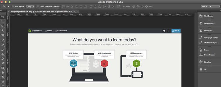
6 Design Courses to Get Your Creativity Flowing

$
0
0

Do you have a great idea for an app or website, but are completely lost when it comes to the layout and look? Treehouse has some great courses to get you started in design and courses on tools that help you along the way. Put your design hat on and check out these courses for creativity and inspiration.

Start learning to code today with a free trial on Treehouse.

1. Web Design Process

Going from a blank screen to a finished website can be daunting. In this course with Nick Pettit, you’ll learn about the major steps involved in designing websites. We’ll learn how to gather information, explore potential concepts, and iterate on a design. By the end, you’ll have the foundation you need to continue your design journey.

Check out the course here

2. Digital Media Through Photoshop (newly released!)

photoshop

Get started with creating your own digital media files. Setting up your documents properly before you start creating will be crucial for your end product. In this course with Shon Dempsey, we’ll learn what those considerations are as well as how to choose the right options. We’ll introduce the most prolific creative application Photoshop to set up our files, make some adjustments and come out the other end with a banner ad suitable for use on the the desktop and mobile as well as print. This course is perfect for anyone looking to get started with design or photography.

Check out the course here.

3. Adobe Illustrator for Web Design

Using a project-based learning approach to Illustrator’s core features, walk through the process of designing a simple website beginning with making a wireframe, and then using that wireframe as the basis for creating a page mock up for mobile and desktop platforms. Along the way, use the basic drawing and shape tools to create an illustrated graphic logo. And with responsive web design in mind, we’ll utilize the benefits of both scalable vector graphics (SVGs) and CSS export capabilities.

Check out the course here

4. Prototyping in the Browser

prototyping-nick

Before you design a website, it’s important to have some kind of a plan or a wireframe to guide your efforts. But sometimes when you go from a simple sketch to digital pixels, the results aren’t exactly what you expect. When you work with real HTML and CSS, and you’re able to see your site on a real screens, you’re able to see a more accurate representation of the final result. In this course, we’re going to build a website prototype using the Bootstrap web framework.

Check out the course here

5. Bootstrap 4 Basics

Go more in depth with Bootstrap in Guil Hernandez‘s latest refresh. You’ll learn to use the latest in Bootstrap 4, one of the most popular open source front end frameworks, to help you build a functional design and layout in little time.

Check out the course here

6. Prototyping with Figma (newly released!)

In this course with Nick Pettit, you’ll learn how to build interactive and sharable prototypes in Figma, a web-based visual prototyping tool. You’ll create a prototype for a “prosumer” mobile photography app, and by the end, you’ll have a better understanding of how to create interactive prototypes that can be shared with project stakeholders and team members.

Check out the course here

The post 6 Design Courses to Get Your Creativity Flowing appeared first on Treehouse Blog.
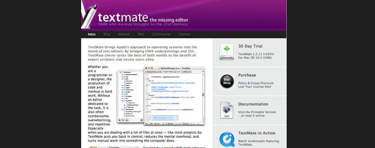
8 New Courses for Developers & Designers

$
0
0

Each week Treehouse updates the library with new courses and workshops so that our students can continue their learning and stay up to date on the newest technology and languages. November was an exciting month as we released new design courses, a new language, and the completion of a brand new track. Data Analysis Basics is last course to complete our brand new Beginning Data Analysis track. Introduction to GraphQL is a brand new query language that can help simplify your workflow and compose more robust APIs. Check out the complete list of new courses below and explore learning something new!

Start learning to code today with a free trial on Treehouse.

1. Data Analysis Basics

screen-shot-2017-07-16-at-9-17-10-pm-1

Learn how to make better decisions with data in this course on data analysis with Ben Deitch. We’ll start by looking at what data analysis is, and then we’ll see how we can use data analysis to create better outcomes.

Check out the course here

2. Build a Selfie App

In this course with Pasan Permaratne we’re going to build an app that is quite popular these days – a selfie app! We’ll learn how to build and apply filters, how to use Core Data for more than just a single entity and how to use the device’s camera to create a fun app!

Check out the course here

3. Introduction to GraphQL

screen-shot-2017-11-16-at-12-38-23-pm

Simplify your backend with GraphQL, the new query language and runtime that is taking the world by storm. With GraphQL, it’s no longer necessary to resolve a bunch of different REST endpoints to get a complete chunk of data. We can use GraphQL to tell a server which data we want, and exactly what it should look like. Whether you’re a front-end developer looking to simplify your workflow, or a back-end developer looking for a way to compose more robust APIs, this course with Isaac Lee Morris is the perfect place to start.

Check out the course here

4. Digital Media Through Photoshop

Get started with creating your own digital media files. Setting up your documents properly before you start creating will be crucial for your end product. In this course with Shon Dempsey,  we’ll learn what those considerations are as well as how to choose the right options. We’ll introduce the most prolific creative application Photoshop to set up our files, make some adjustments and come out the other end with a banner ad suitable for use on the the desktop and mobile as well as print. This course is perfect for anyone looking to get started with design or photography.

Check out the course here

5. Prototyping with Figma

In this course with Nick Pettit, you’ll learn how to build interactive and sharable prototypes in Figma, a web-based visual prototyping tool. You’ll create a prototype for a “prosumer” mobile photography app, and by the end, you’ll have a better understanding of how to create interactive prototypes that can be shared with project stakeholders and team members.

Check out the course here

6. Active Record Associations in Rails

Most of your Rails models are going to be connected to other models in some way. An Author has many Articles, and each Article belongs to an Author. A Doctor has many Patients, and a Patient may have many Doctors as well. Rails uses associations to make it easy to track these relationships in your database. Learn about Active Record Associations in Rails in this course with Jay McGavren.

Check out the course here

7. What’s New in React 16

react16

The new core architecture of React 16, codenamed “Fiber,” introduces lots of new, highly anticipated features and improvements to React. Get up to speed with new features in React 16 in this workshop with Guil Hernandez.

Check out the course here

8. Java Arrays

Arrays are container objects that can be used to store multiple values. In Java Arrays, we’ll talk all about what they are, how to create them, as well as why and when you should use them. Check out this course taught by Craig Dennis.

Check out the course here

Coming soon!

Build a Chatbot with Watson APIs

IBM has created an AI platform named Watson that gives businesses and developers access to powerful tools for text and speech analysis, computer vision, and more. Watson APIs consist of a suite of services used to process or analyze data to answer questions and make decisions. This course will show you how to build a chatbot with Node.js and Conversation services from Watson. You’ll also learn how to setup and deploy your bot on IBM’s Cloud platform.

Check out the upcoming course here

These are just a list of courses released this month. Our Treehouse Library currently has over 300 courses and workshops for you to check out!  Do you have a Treehouse favorite? Let us know in the comments below!

6 Design Courses to Get Your Creativity Flowing

The post 8 New Courses for Developers & Designers appeared first on Treehouse Blog.
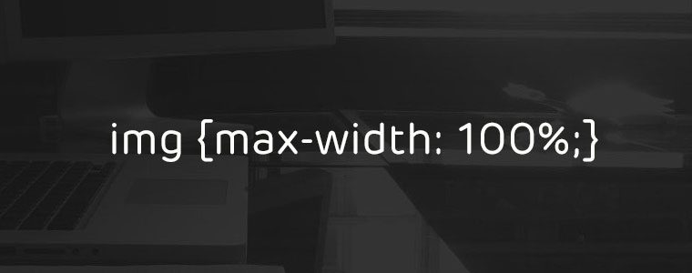
Viewing all 20 articles
Browse latest View live


Latest Images