Now that we’ve killed Photoshop, we need to get into the nitty gritty of how to still make a living without our favorite, yet most frustrating app. After all, talking about what’s broken without offering a solution doesn’t do anyone any good.
In this second installment of Responsive Web Design in the Browser, I want to talk about what I use everyday to try and escape the gnarly grasp of the Photoshop beast. It’s not a perfect system yet, but it’s getting better everyday. I hope this gives you a starting point and a few resources to develop your own process for designing in a post-Photoshop world.
Important note: You may be a designer that designs only in Photoshop and you’ll argue that this article suggests that all designers should code. Honestly, that’s exactly what I’m proposing. We’re talking about web design and to me it makes more sense to use the web to design than using an image editor.
Here’s my process for designing without Photoshop:
1. Choose Your Text Editor.
The text editor is by far the most important tool for the web designer. It’s the lifeline app that we absolutely can’t live without, not Photoshop. Although everyone with a computer has access to a free text editor, there are three main editors that seem to currently be the most popular.
Sublime Text
If you’ve watched any of the most recent Treehouse Tutorials, you’ll notice that the designers (and developers for that matter) on the teaching team have all been using Sublime Text 2. It’s a clean text editor with much of the functionality you need, while getting rid of the stuff you don’t.
Coda 2
Coda 2 is the latest installment from Panic. It has many extra great features and works nicely with a built-in ftp functionality that lets you quickly upload your files to your server. It’s important to note as well that many designers prefer Coda because the interface has a much more “designed” feel to it.
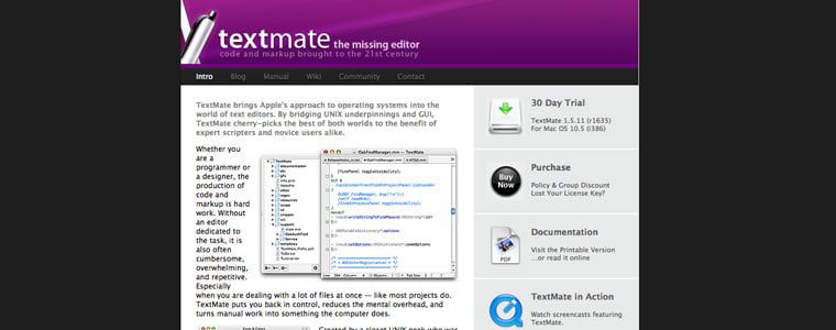
Textmate
Textmate has been the stripped-down text editor that many people have loved for years. It’s simple, yet gives you the color differences and collapsing that you don’t get with the free editors.
2. Create Your Markup in HTML.
A great design should start with the content. Although getting content from a client is harder than getting them to approve a Photoshop mockup, designing from the “content out” gives you the basis you need to decide the approach you want to take. How can you design the best solution when you’re not sure of what needs to be said? Our jobs as designers are to be great communicators and establishing what the client wants to say is a great place to start.
Once you’ve got your content, mark it up in html using the best practices of creating great, semantic markup. Make sure your markup is completely accessible to those that have disabilities as well as making it ready for readers like Instapaper or Readability.
3. Create Your CSS Reset and Stylesheets.
Now that you have the html structure of your website, decide on the best CSS reset so that you eliminate all of the built-in styling from the individual browsers to give yourself full control of your styles.
Once I’ve decided on a reset, I usually create multiple stylesheets in my text editor, with media queries at popular breakpoints, and save them. I create multiple stylesheets like most people create multiple mockups in Photoshop. All of have to do to show a client a different look is change “style1.css” to “style2.css” in the link in the head tag of my html document. Once they’ve decided on which look they like, we can work together in the browser to make the final tweaks. For now, we’re just setting it up so we have this ability once the design is complete.
Once I’ve got my stylesheets created, I usually hop on over to Colour Lovers or Kuler to find a color palette I like based on the colors from the client’s logo or branding guidelines. Then I place the color values in the comments atop the CSS file so I have them for reference throughout my design process.
4. Upload and Hookup Your Javascript and jQuery.
The next step in our setup is to define the different types of Javascript files we want to use for our project and make sure that they’re loaded and the scripts are placed in our code to “hook them up”. Here are a few of the Javascript files I’ve used on multiple projects:
FitVids.js

FitVids, from the lads at Paravel, Inc, is the best plugin I’ve found for creating responsive videos.
If you’re going to be using video in your design, FitVids.js from Paravel is a must have. You’ve likely encountered this plugin on just about every responsive site you’ve visited lately. I don’t know what I would have done without it.
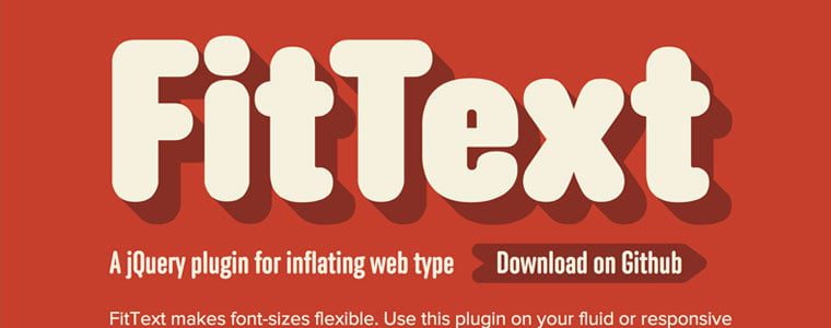
FitText.js
FitText.js is another Javascript plugin from Paravel that allows you to create fluid headlines that fill the container that you’ve given them. It leads to a better design and one that doesn’t look broken at certain break points.
Respond.js
What would web design be without having to look out for other browsers? Even more than Photoshop, this is probably the biggest frustration in the world of web design. Luckily, there are genius people out there that create great Javascript like Respond.js to take care of the browser support for us.
5. Open Your Browser of Choice.
In order to design using the browser, we’re going to have to pick one, naturally. The big three are Safari, Chrome and Firefox. Designers typically choose one based on their own preferences or biases, but all three are great and have their own developer tools.
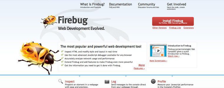
Firebug
One of the great things about designing with Firefox is the Firebug developer tool. I’ve used this one for a long time and have had a great time using it to design in the browser.
6. Know The Magic Equation.
The most important key in Responsive Web Design is knowing the magic equation. This isn’t necessarily a post on how to do Responsive Design so I won’t go into great detail here, but knowing how to convert pixels to ems and percentages is absolutely vital.
7. Build Your Fluid Grid.
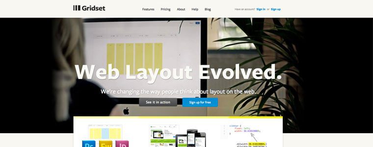
Gridset
Gridset, the great new tool from Mark Boulton and the awesome crew at Boulton Design, will allow you to build the perfect responsive grid for you new project. I’ve used it a lot lately and recommend it to anyone looking to experiment with different grids. It also allows you to save grids from other projects for future use.
Frameworks
If starting your grid foundation from scratch isn’t for you, then Bootstrap, Foundation, and Skeleton are a just a few of the Responsive CSS frameworks that are available to you. They come complete with grid structure, content layout, and built-in CSS for buttons, etc. Frameworks enable you to get off the ground and running even faster, and they have a structure that has been proven over and over again to be reliable and flexible.
8. Set Your Fonts, Type and Layout.
Now that you’ve got your basic grid laid out, it’s time to consider how you will structure and style your text. Knowing what your reader’s needs are, and then designing the proper content structure for them, will lead to the best product possible.
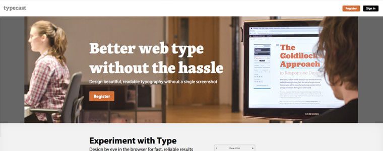
Typecast
I’ve had the great pleasure of using a new web-based tool for designing content-first layouts called Typecast. Rarely have I ever had so much fun using an app to set type and content style.
Using the fonts from the great web font services like Typekit, Fonts.com, Font Deck, and Google, you can use Typecast to see how your fonts will look in real-time and right there in the browser. It’s amazing and you’ve got to check it out. It’s currently in beta, but after they personally took me through the app, I see it as being a huge game-changer.
9. Test, Test, Test.
Since Responsive Web Design has gained so much traction, that means that people everywhere are creating great Javascript to aid in its growth. A few websites you can use to test your designs in the browser are Responsinator, Responsive.is, and Responsive Design Testing, just to name a few.
10. Edit Your Images.
Here is one of the biggest challenges facing a world without Photoshop. We still have to take care of crafting and preparing our images. Luckily, we have new alternatives such as Acorn that are less expensive and a lot less bloated. Also, if you’re on a tight budget, you can just Google free online image editors and pick the one you like the most.
Conclusion
I know that this topic is a sensitive one. For years designers have used Photoshop to push our craft forward. I’m not so naive to think that Photoshop will disappear overnight, but I wanted to show you, our great reader, that the future of Web Design is upon us.
Two great strategies, Designing in the Browser and Responsive Web Design are both here to change our industry and change the way we work. I hope this article opened your eyes to some new possibilities and some new tools. Go forth and create, but do it in the browser!
Test out these strategies and tools, decide what works for you, and write me to tell me about it. I can’t wait to hear how it goes…
The post Responsive Web Design in the Browser Part 2: The Tools appeared first on Treehouse Blog.


