How it used to work
In the past, once we were given website content by the client or project manager, we’d move forward with a digital wireframe or sketches. We may have even made those wireframes interactive using great resources out there like MockingBird or InvisionApp. Later we’d design every last detail in Photoshop down to the kerning on type, and border-radius’ on buttons. Usually after a series of revisions, the approved design would be sliced up, coded and tweaked it until it looked just like the comp. And finally, when it looked exactly the same in every browser, we’d launch it.
The problem with this process
Unfortunately as web designers & developers (but fortunately as consumers), we don’t just have a couple types of mobile devices and a handful of screen resolutions anymore. Mobile websites aren’t seen as a secondary or additional website to the desktop version. They are now seen as one. We live in a world with tons of different devices and resolutions, and new ones coming out everyday. We should be happy with this forward movement in technology… right?
Well… it’s kind of thrown a wrench in our process. Showing the client a high fidelity 980px wide comp isn’t the best deliverable anymore. Right off the bat it this sets false expectations. But is designing a tablet and mobile equivalent of the same site really an option? No. That would take forever. So how can we evolve our process moving forward to accommodate for the responsive web?
“Design in the browser!”– Awesome people in our industry
Many leaders in the industry have advocated designing in the browser. And I get it. It makes total sense. The father of Responsive Web Design himself, Ethan Marcotte, refers to static comps during the responsive design process as a “catalog of assumptions”. Meagan Fisher wrote a great article back in 2009 and quoted her then boss, Dan Cederholm – “a website’s design should begin where it’s going to live: in the browser.” And our very own Josh Long recently wrote a really convincing article about why we should kill Photoshop.
Why I can’t do it
I’ve found it really difficult to adapt this way of design. Maybe it’s because I’ve always considered myself to be a designer first, and a developer second.
When I’m in Photoshop, it’s a blank canvas where me and my right brain are free to explore all sorts of creative UI solutions without the distraction or limitations of code. Do whatever I want and figure out how to make it work later on. Diving right into code for me personally, has a couple of negative consequences – the design ends up being sterile, too simple, and nothing exceptionally innovative. It’s also way too much commitment. Early on in my design process I like to rapidly prototype, move things around and try different things. I keep building and moving things around until I like it and want to commit to making it a reality in code.
Okay so maybe I’m a little obsessive compulsive. I don’t like the idea of letting go – but that’s what we need to do. I see Responsive Web Design as the final push to let go of some of this control we as designers have tried to hold onto, in an era where it’s just no longer possible.
Moving Forward
So for those of us on the same page, how do we move forward? How to we evolve our process for responsive web design? While it’s still something I’m trying to nail down myself, I thought I’d share with you the direction I plan on heading.
Sketch
This is a step for me that will never go away. But it can evolve. Instead of using my beloved UI stencils browser sketch pad, it’s time to invest in a few of AppSketchbook’s responsive design sketchbook. For days when I’m feeling less fancy, I’ll simply draw out a few breakpoints in my Whitelines sketchbook. Thinking about how breakpoints will affect your layout early on in the design process will make things easier for you later on.
Wireframe
Once I’ve nailed down my layout, I’ll take it a step further and wireframe the actual content around a grid at various breakpoints in either Illustrator or Photoshop. Here, I can begin playing around with fonts, button styles, and begin developing the UI – making sure to avoid too much detail to save time.
Clik here to view.

Leaving detail out also allows the client to focus on the content itself, instead of the decoration around it.
UI Style
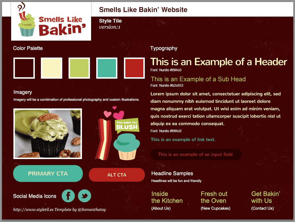
This is where the big change takes place. Instead of moving forward with the wireframe and designing a full-fledged mockup which is too precise, or gathering inspiration for a traditional moodboard which is too vague, I’ll use something like Samantha Toy’s “Style Tiles” to create a visual design for the brand.
Clik here to view.

It’s much easier to create a series of these “UI moodboards” than go through several revisions of detailed mockups.
Code
Now that we have a layout nailed down, a clear direction for the user interface, and an idea of how our website will break down, we can confidently move forward with the code.
Conclusion
With this new process, we’ve solved most of our issues here with designing in the browser. I feel like it’s a happy middle ground to saving time and energy that Photoshop has cost us in the past, without sacrificing the creative aspect of designing a website. It will still be a big change, but a bit less drastic than completely killing off Photoshop and diving right into code.
It all comes down to what works best for you and your company. There’s no right or wrong process, it’s just about finding one that’s most efficient for you.
The post What to Do When You Can’t Design in the Browser appeared first on Treehouse Blog.